Luna Grill
Director of Art & Media, 2013 to 2015
Luna Grill brought me on for graphic design and photography. The role grew fast from there: directing the photo shoots, weighing in on the interiors, and before long, taking on the identity itself. What the company needed underneath all of it was an identity system that could carry a handful of San Diego restaurants into a multi-state chain. The identity I built carried the brand through more than a decade of expansion, from fewer than 10 locations to more than 60 across three states. The system has evolved since, but on the foundations I set, and the wordmark is still in service today.
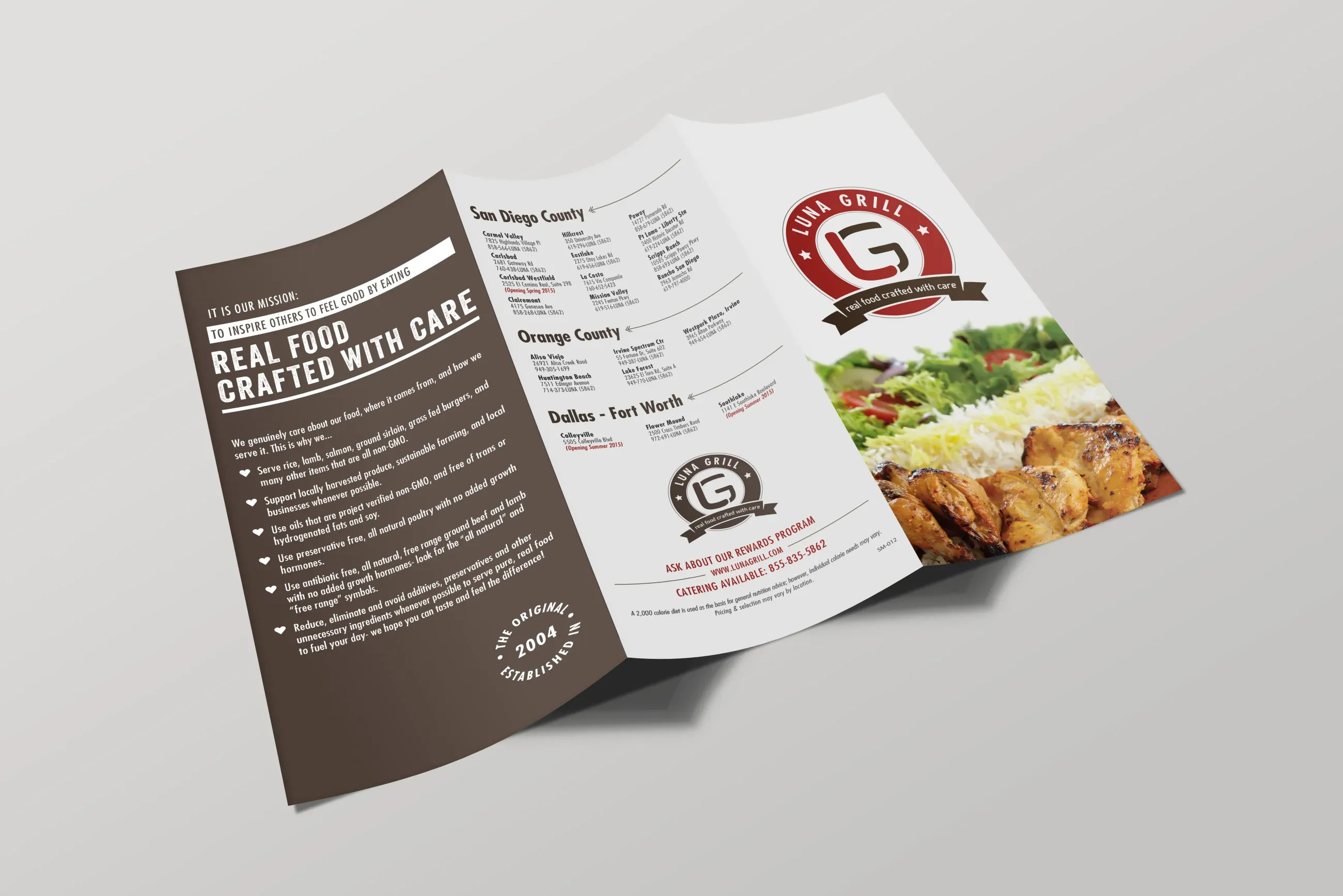
When I took over art direction, Luna Grill had a problem more basic than any design issue: people couldn’t tell what kind of food it served. The logo was set in a brush script that read as Asian, and customers were walking in expecting the wrong cuisine. The menu was printed in red on white from top to bottom, and the first time I ate there, I couldn’t decide what to order, because every item on the page was shouting at the same volume. None of this was fatal for a handful of San Diego restaurants where the staff knew the regulars. But the company was preparing to expand, and what it had wasn’t working the way the owners needed it to.
Before
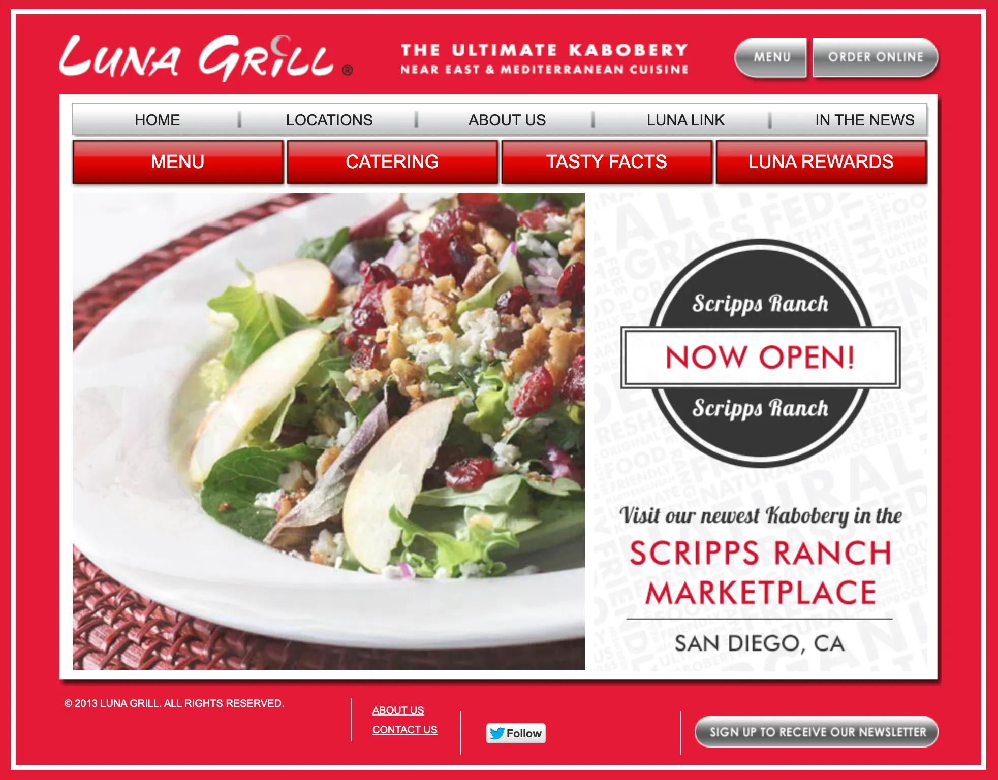
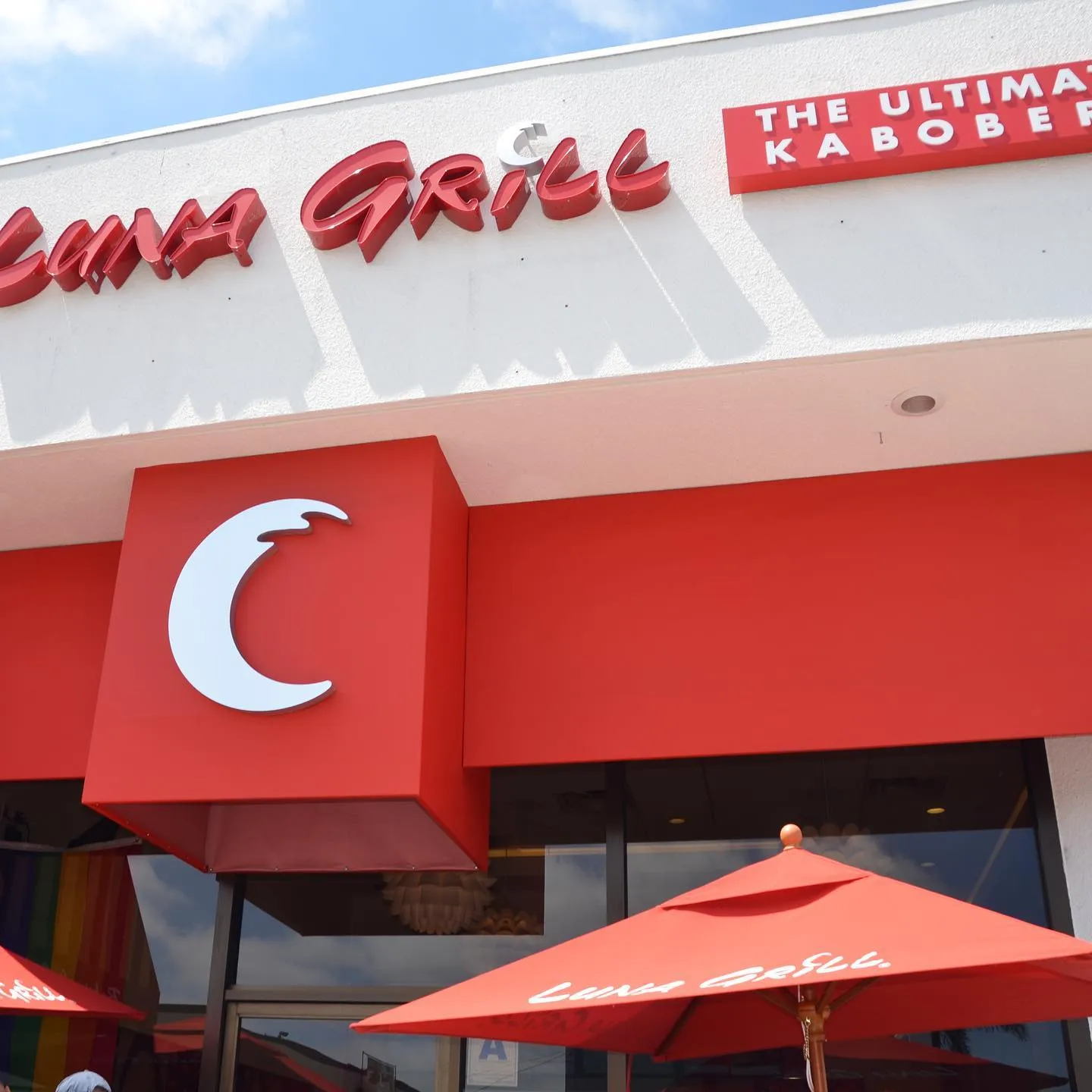
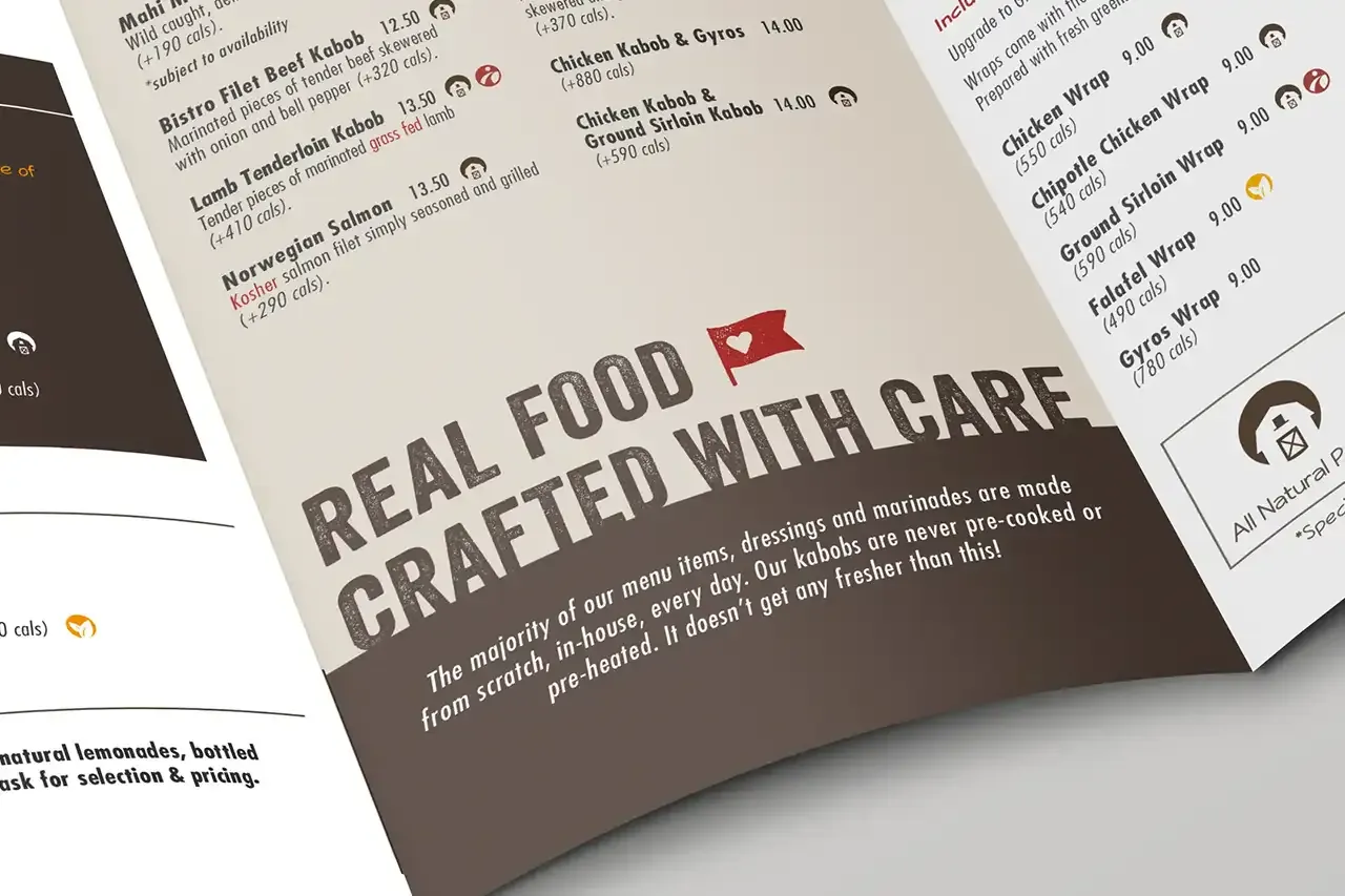
The work started in a series of brand workshops led by Terri Funk Graham, former SVP and CMO of Jack in the Box. My contribution there was verbal. I coined “real food crafted with care,” which became the brand’s promise and ran on menus, packaging, and in-store signage for years afterward. Out of the same workshops came the audience definition I developed, which informed the identity work that followed. The positioning kept moving after that, through Mediterranean kitchen and eventually to fresh Mediterranean, but the promise underneath it held, and it kept echoing in the company’s own language for years afterward.
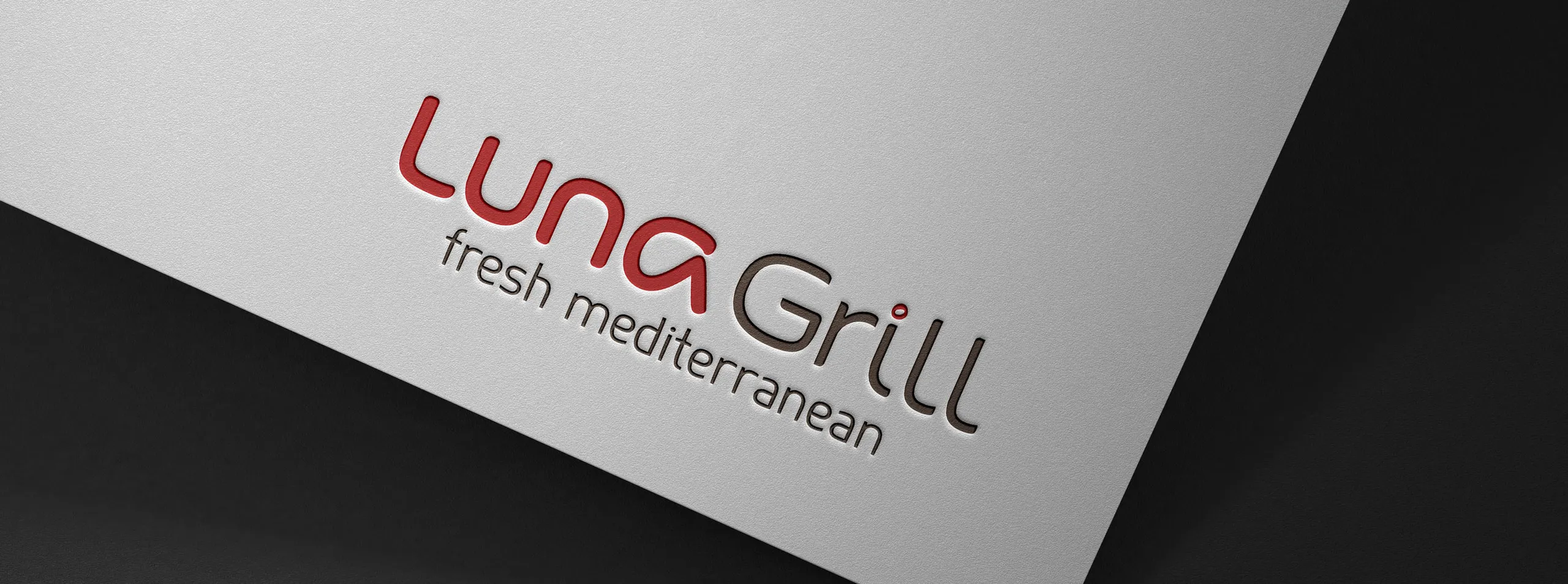
The brief was to fix a mark that was signaling the wrong cuisine. The obvious answer was to make it signal the right one. I went the other way and made it signal none.
The category was still unsettled. Persian, Mediterranean, and Greek were all on the table, and any wordmark that committed visually would have locked the company into a decision it hadn’t made yet. So the mark was built to be neutral on cuisine and distinctive against the competition, and the words were left to say what the food was.
The selection was elimination by surface. I tested candidates against everything the mark would have to survive: print, outdoor signage, embroidery, bags, cups, and screens. I customized the letterforms from there, folding in stakeholder input along the way, until we had a mark the whole company could move forward on with confidence.
The descriptor changed at least three times in the years after. The wordmark absorbed every one of them without a redraw.
The emblem was a separate problem from the wordmark. A horizontal lockup can’t fill a square and it can’t work as window frost, and both were formats the brand needed constantly. So I designed a monogram badge to live where the full lockup couldn’t go: window decoration, small-scale signage, social avatars, anywhere the space was square or the mark had to survive at low resolution.
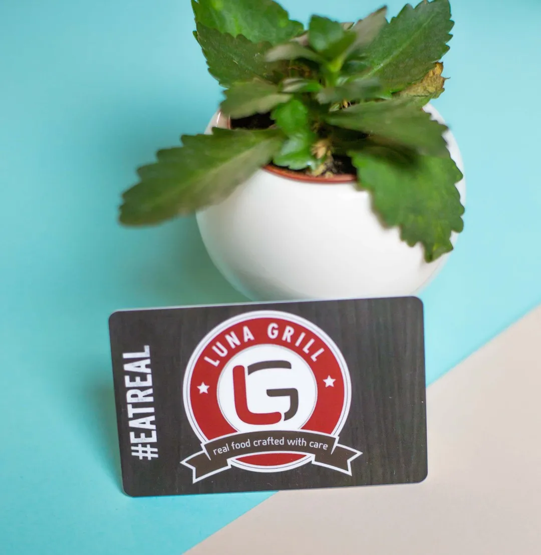
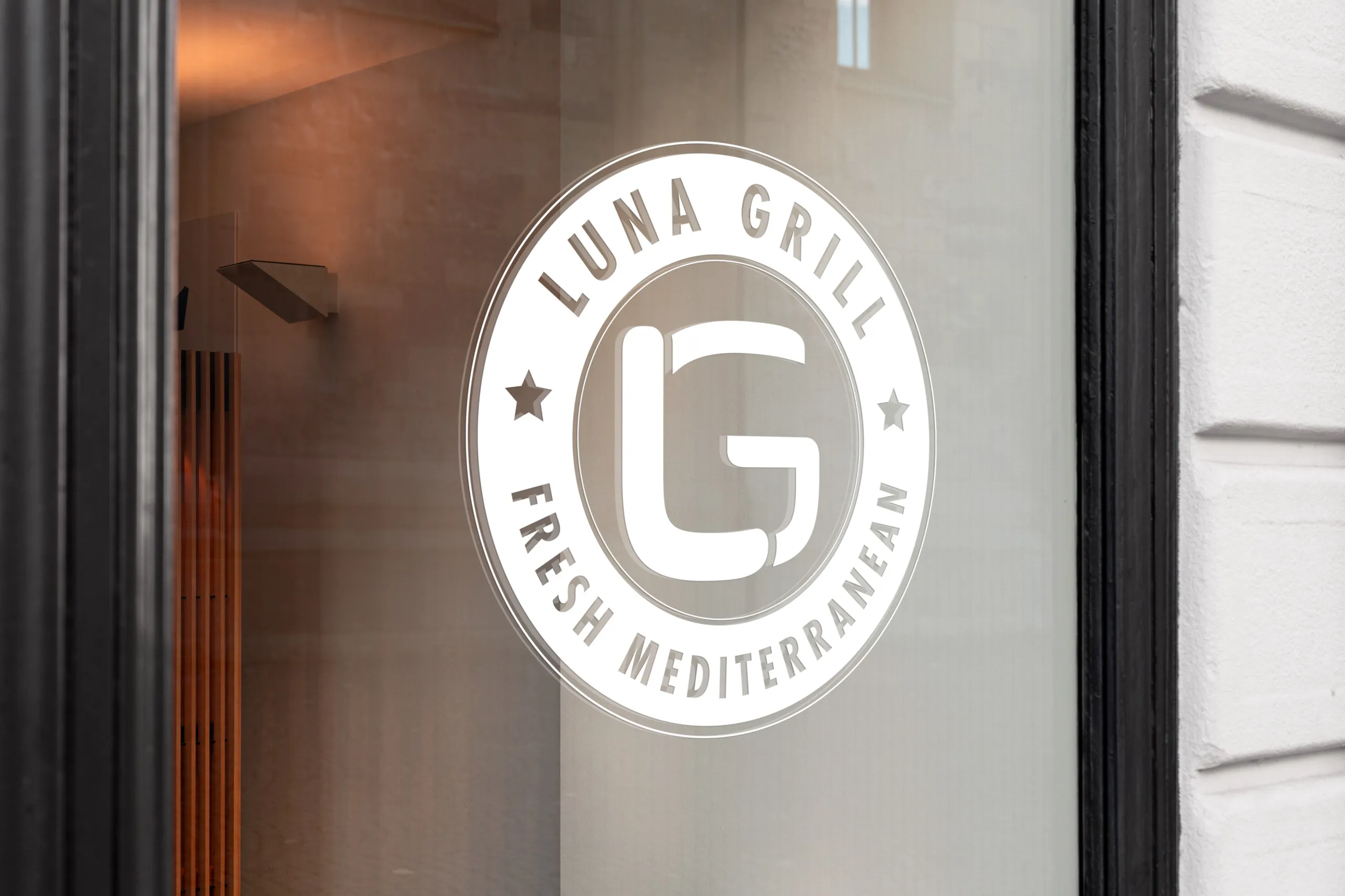
Dropping red was never on the table. It was the one piece of the old brand customers already recognized, and this was already a large shift.
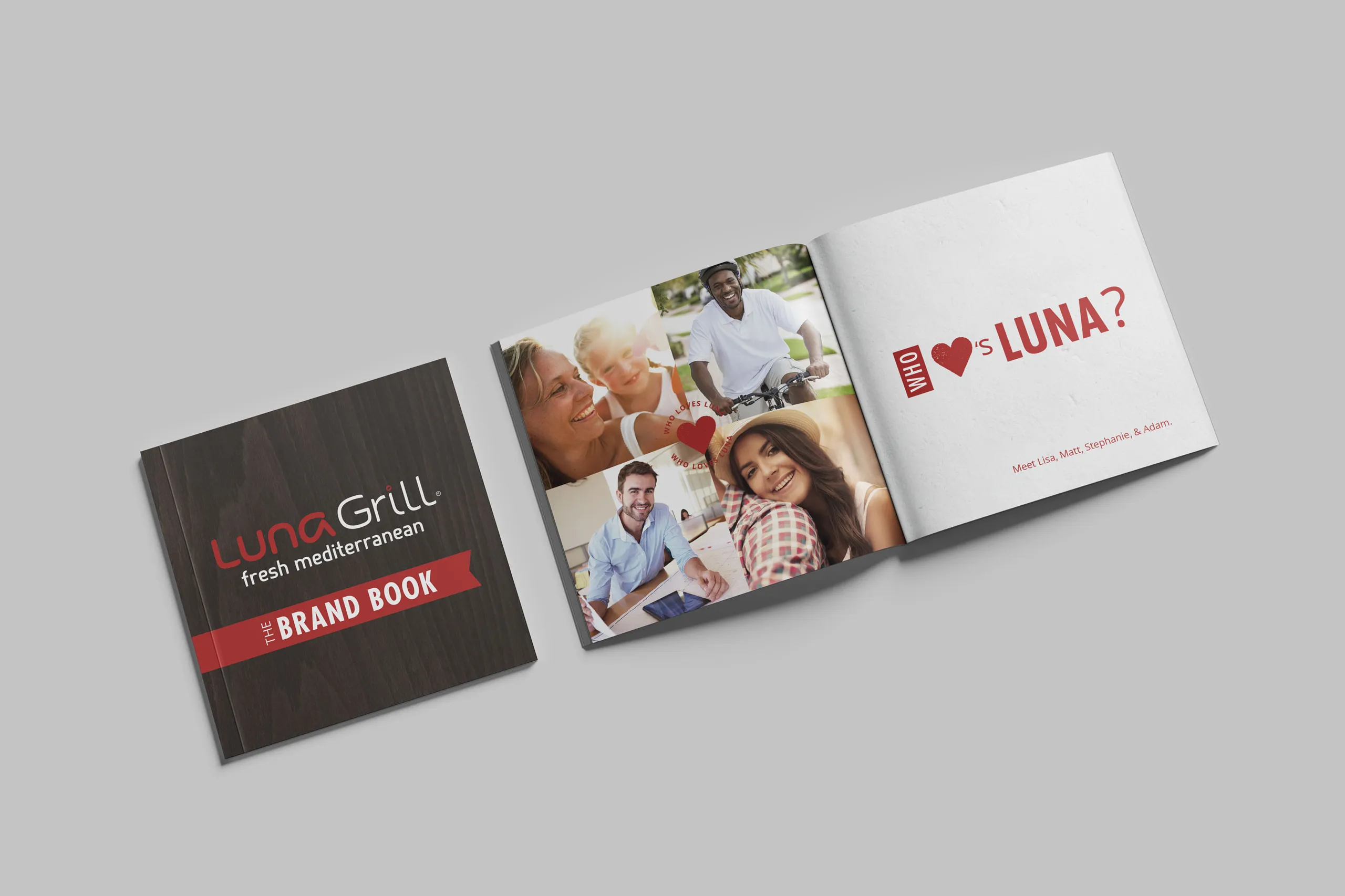
So red stayed, but demoted from the only color to the primary accent, with browns, beiges, yellows, and hints of green underneath it, a palette built to feel healthy and take some of the heat off the red. That gave the menu a hierarchy it had never had, so a first-time customer could find their way down the page. It also tied the printed material to the wood and stone in the restaurants, which meant the brand and the room finally looked like the same brand.
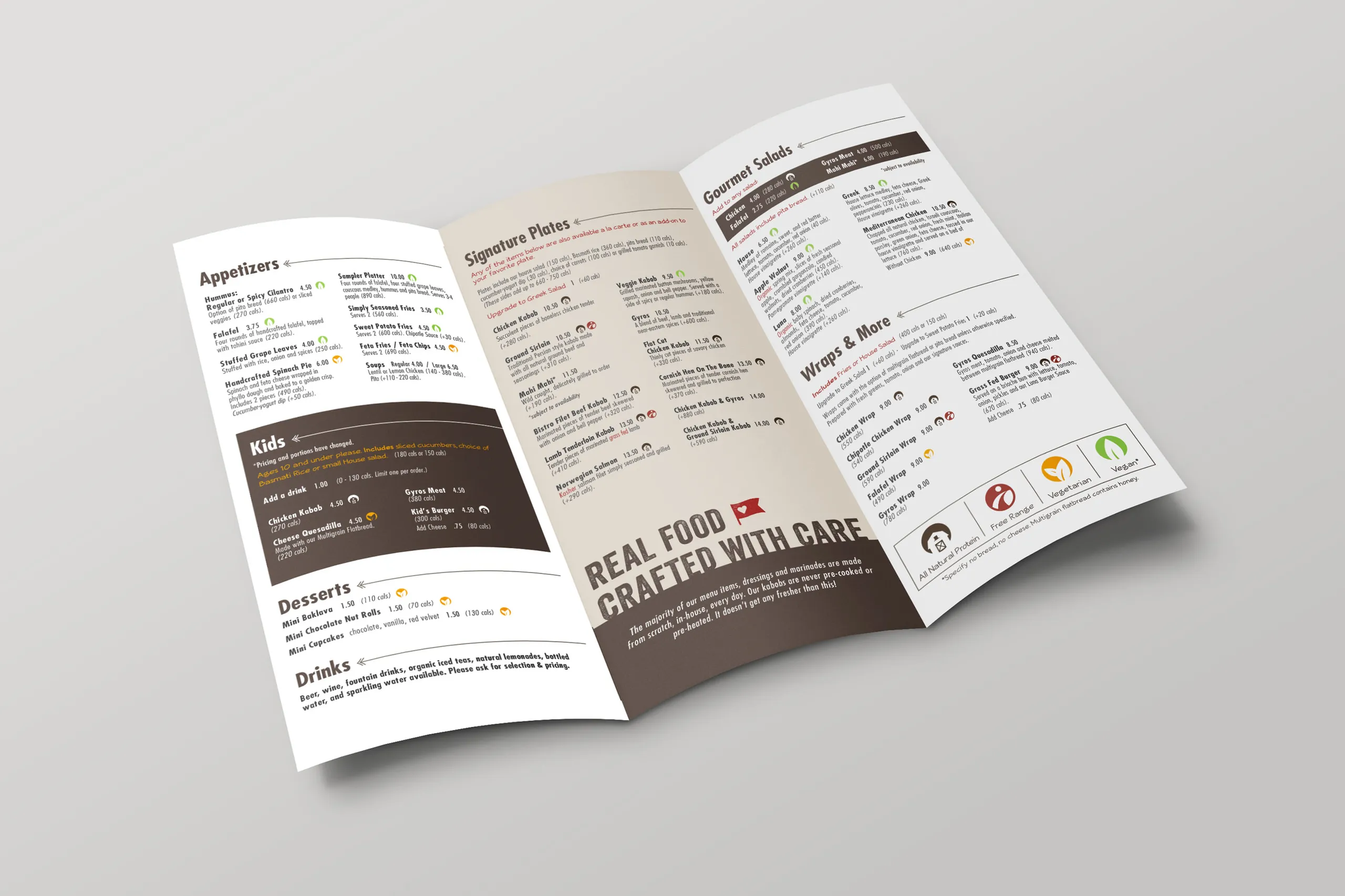
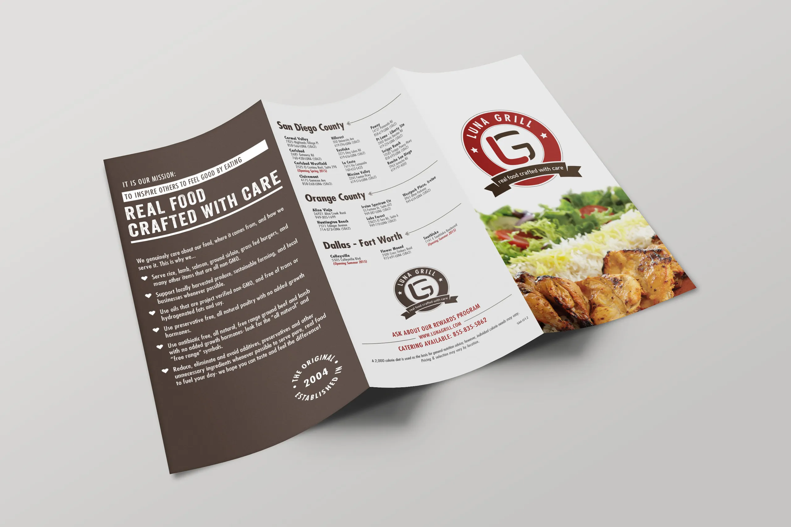
Red demoted to accent. Browns and creams carry the page so the eye has somewhere to rest and somewhere to go.
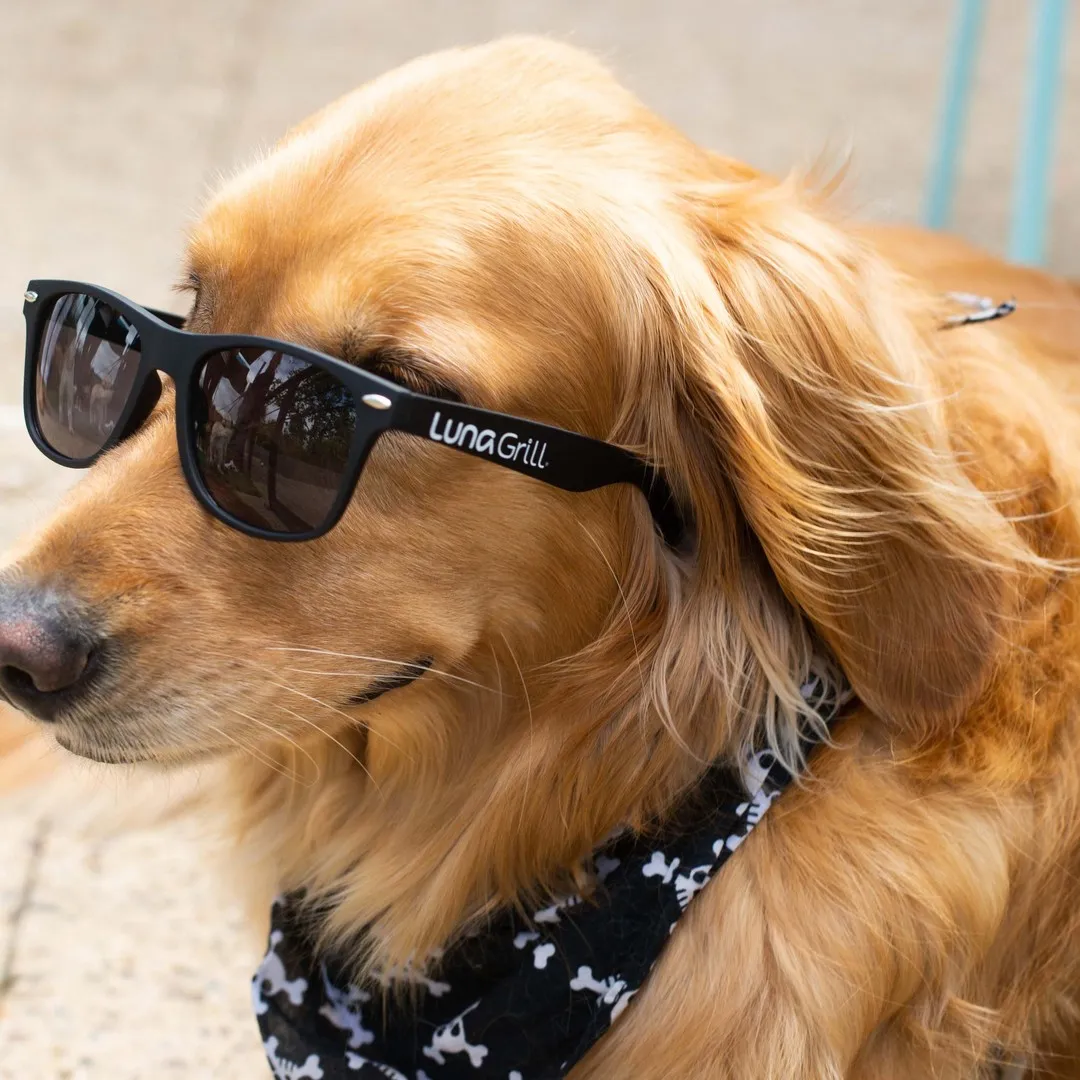
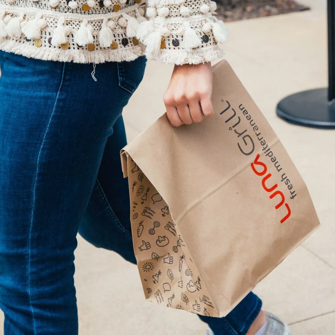
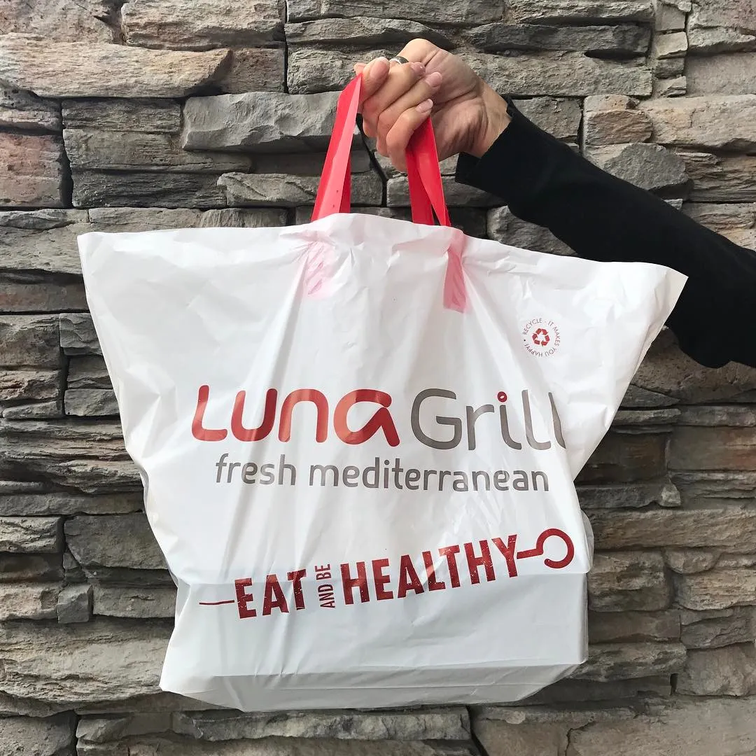
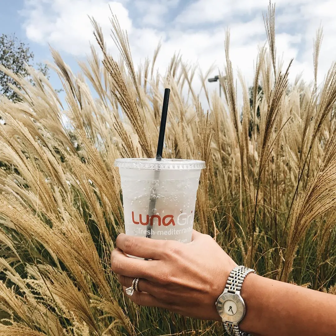
The system at every scale it had to survive: packaging, catering bags, cups, and even the merch. Packaging is where a mark gets tested: one color, cheap substrate, no control over the lighting.
The system in the field, at locations old and new. What had to be true at ten locations, still true at sixty.
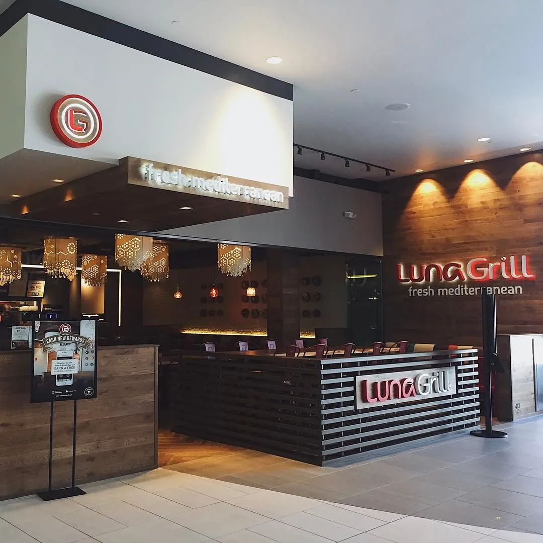
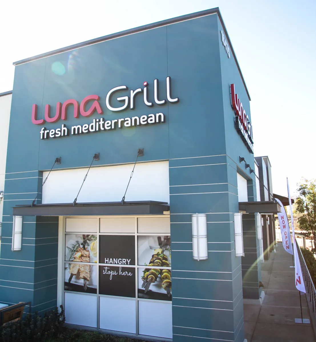
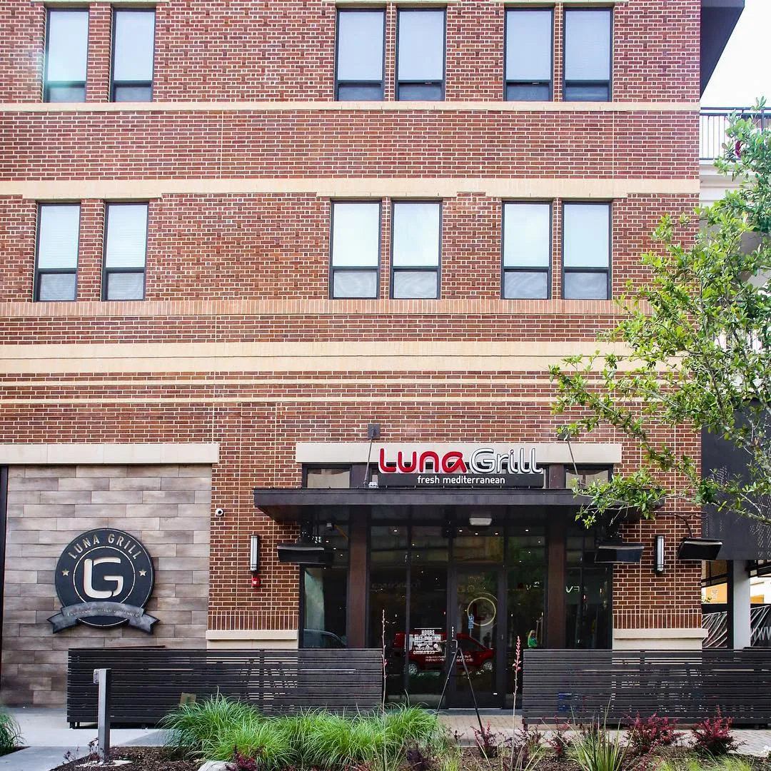
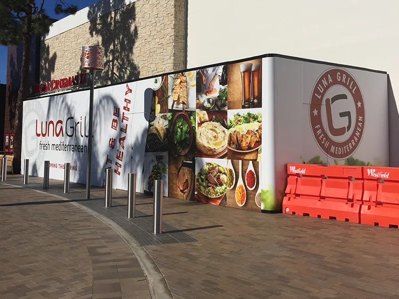
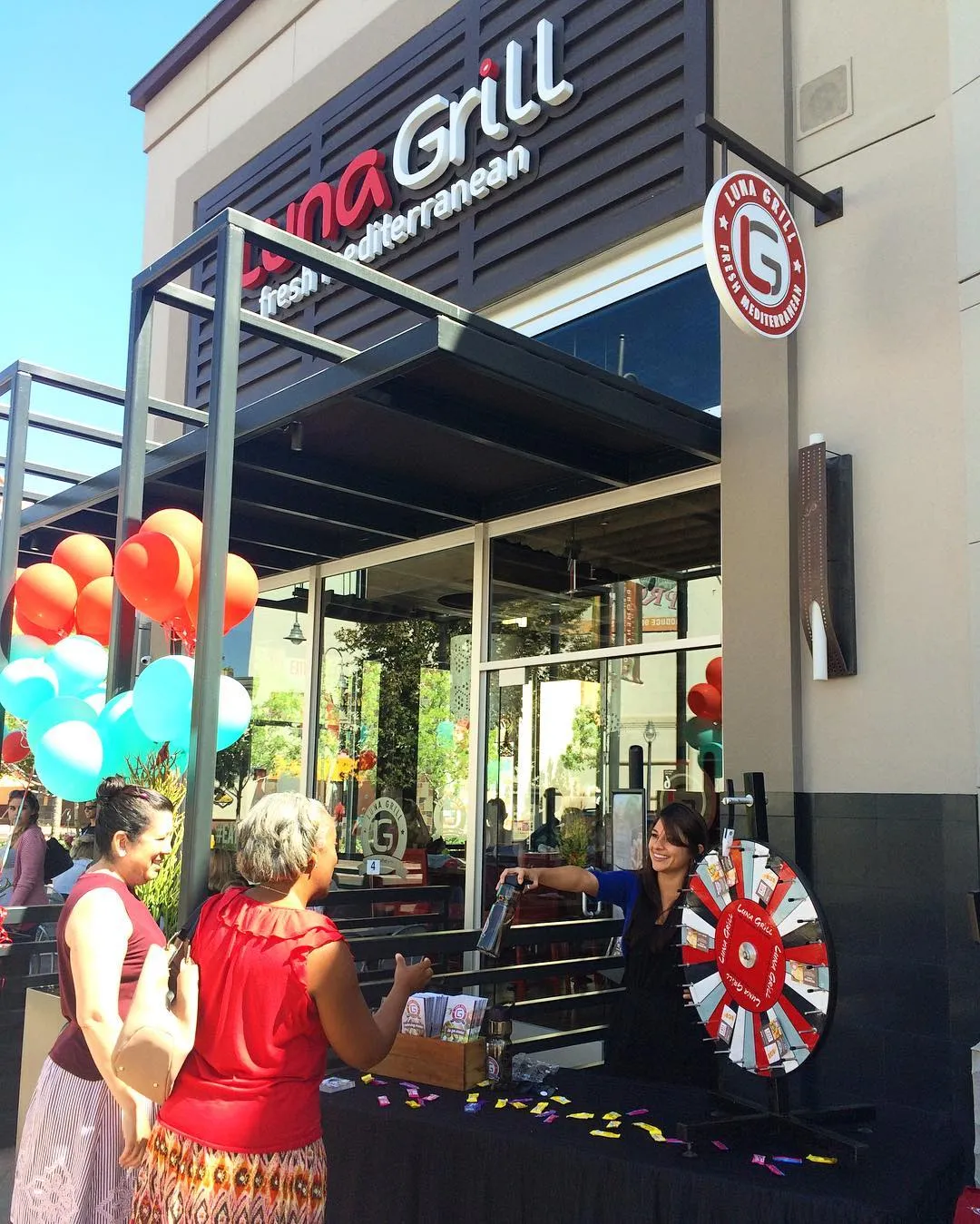
A system is finished when other people start carrying it around.
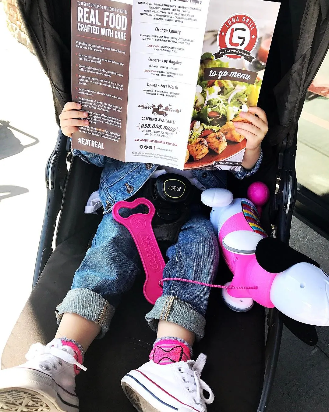
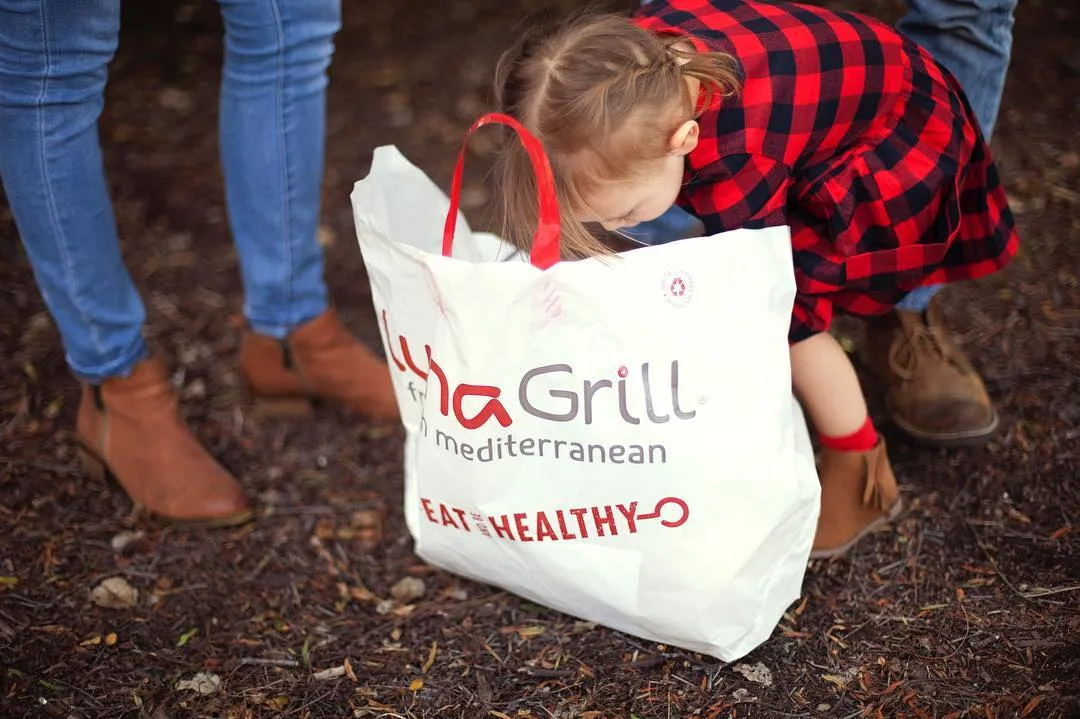
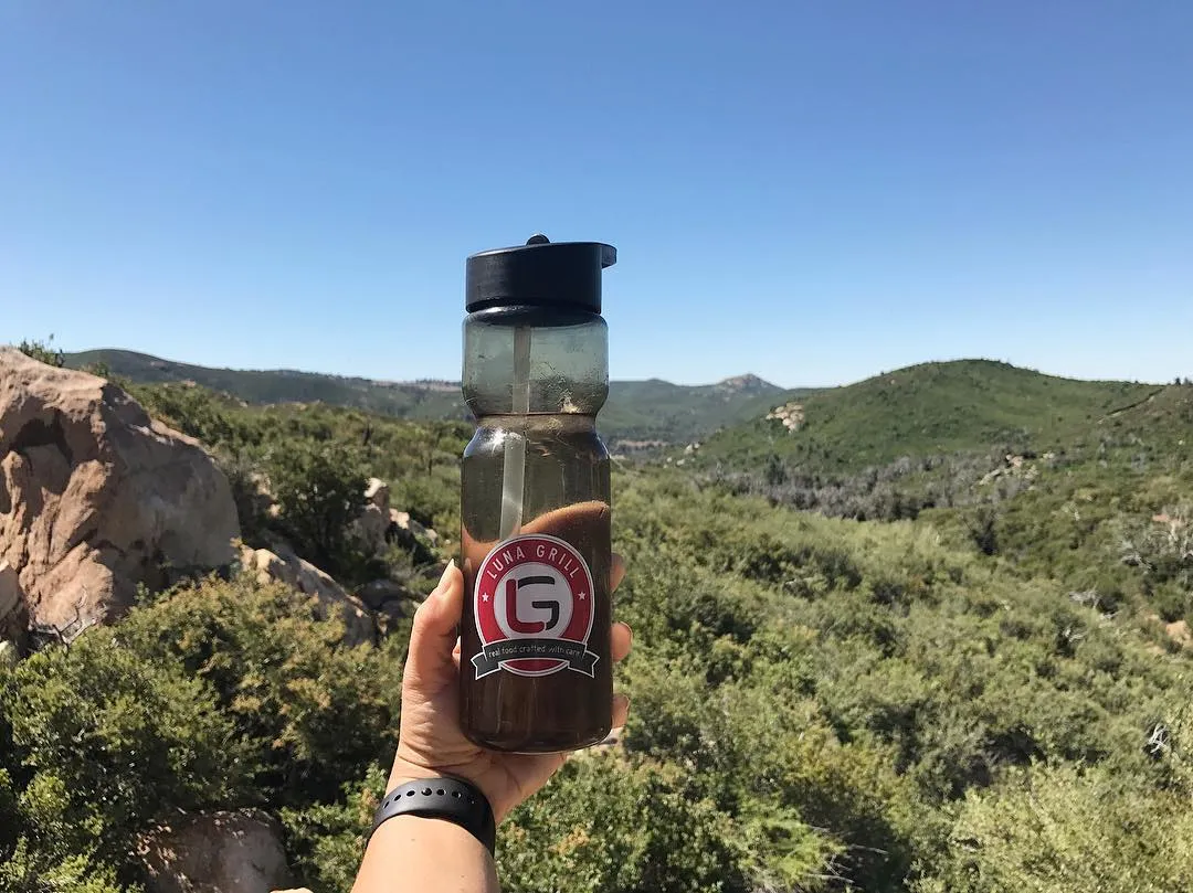
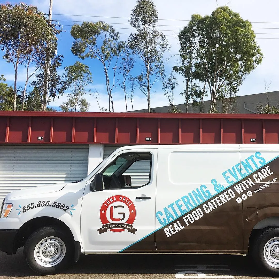
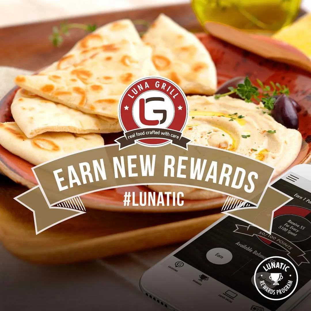
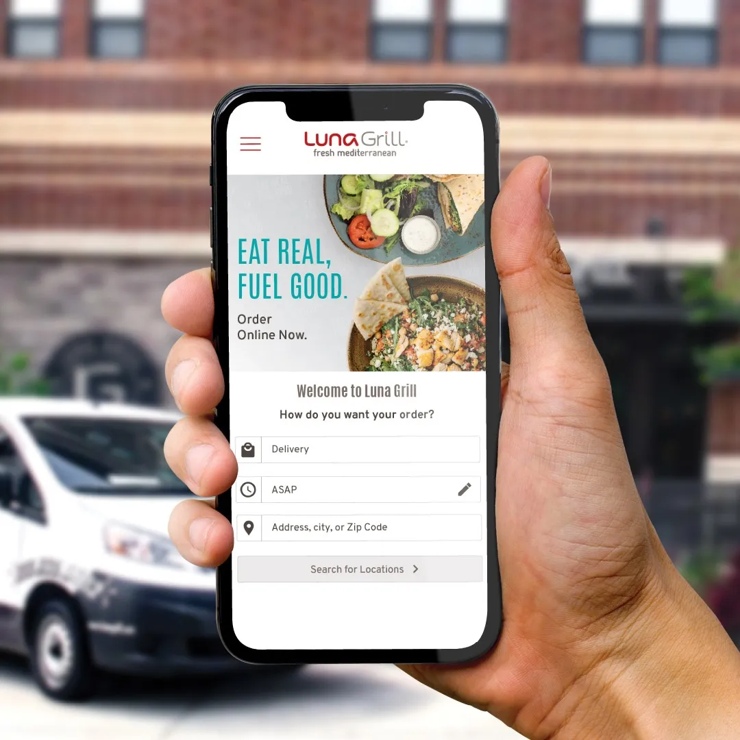
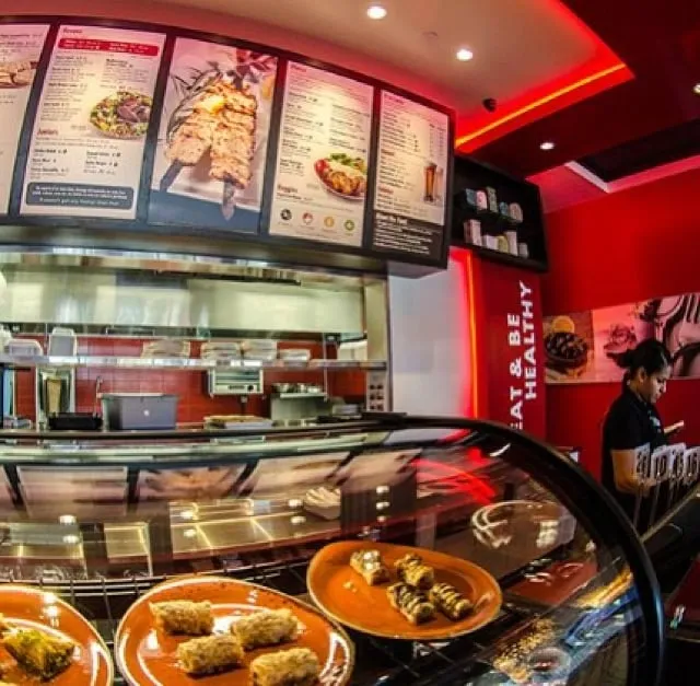
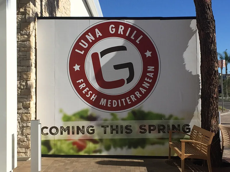
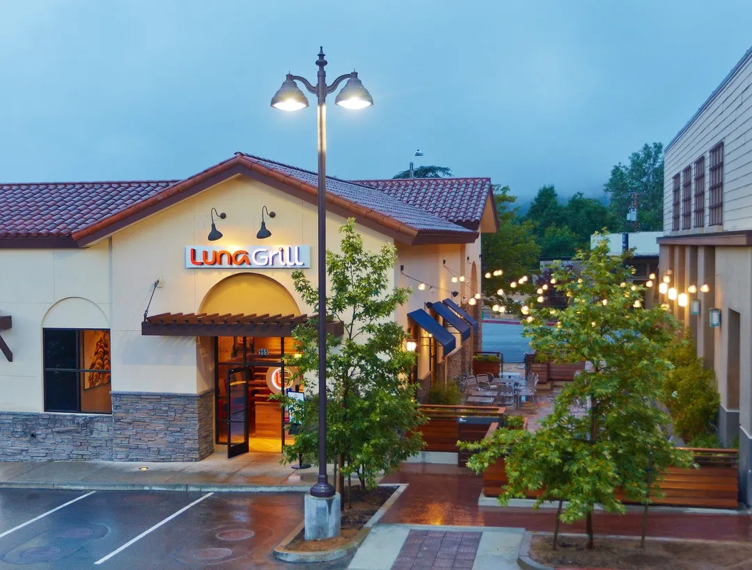
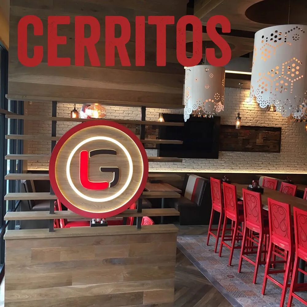
The identity carried Luna Grill from fewer than 10 locations to more than 60 across three states, through more than a decade of expansion.
The system has evolved along the way, on foundations that haven’t moved. The wordmark has absorbed three descriptor changes without a redraw, and it’s still on the wall today. The promise I wrote for it echoed in the company’s own language for years.