SkyLink
Creative & Digital Marketing Lead, 2021
Blue Sky Network had spent twenty years building satellite tracking hardware, and their flagship platform was called SkyRouter. In 2021 they were preparing to launch something bigger: a dual-mode communications device that could switch between satellite and cellular networks on its own, sold across land, sea, air, and IoT markets at once. It needed a name, an identity, and a complete set of launch materials. I was responsible for all three.
The product came to me as engineering specs and a launch window. I named it SkyLink.
The reasoning was simple and deliberate. Blue Sky Network’s established platform was SkyRouter, and customers already trusted that name. A sibling name told the market this was family: same company, same reliability, new capability. “Link” described exactly what the hardware did, connecting assets to networks and to each other.

The name went onto hardware labels, into FCC and Iridium certification documents, across four product lines, and into distributor and partner materials that repeat it in their own layouts. It has held unchanged since launch.
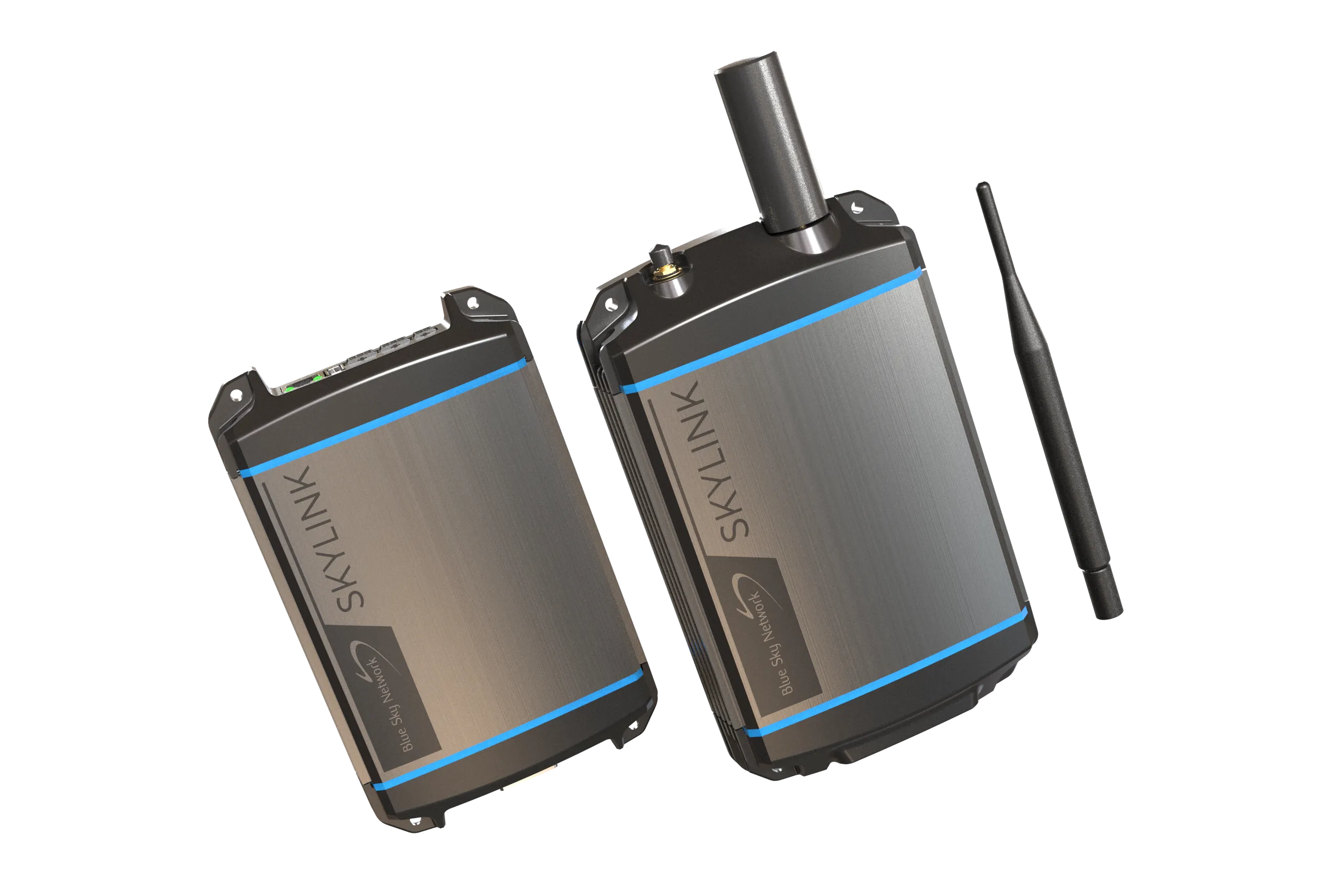
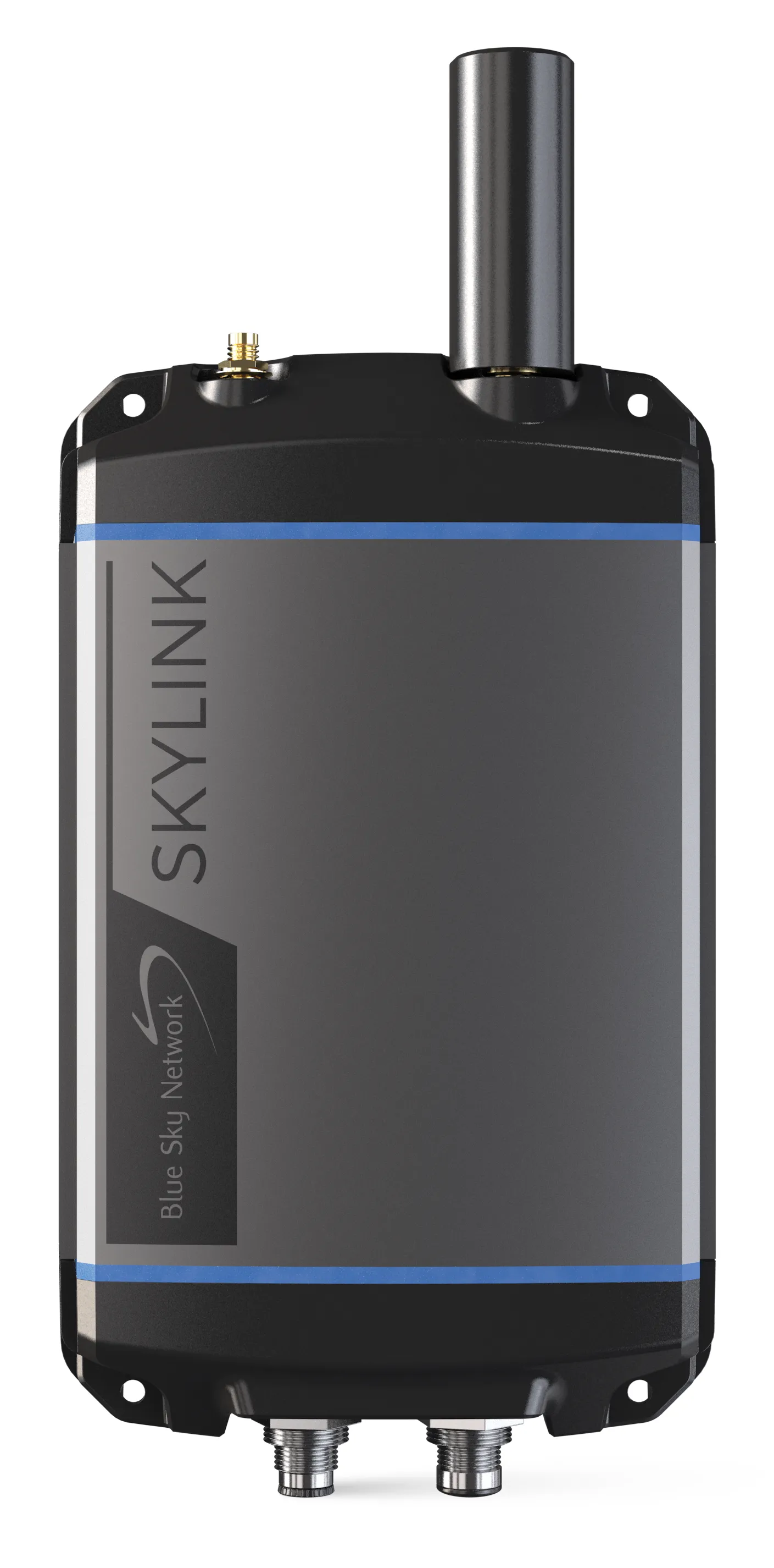
The Blue Sky Network and SkyLink lockup on the Data Gateway and Communications Companion.
SkyLink was conceived as a family from the start: the 5100 for land, the 6100 for maritime, the 7100 for aviation and UAVs, and SkyLink Cloud Services tying them together. The products would roll out over time, but the identity had to hold across all of them from the first launch. Four audiences, one identity.
I built one identity system and every product used it. Each brochure shares the same architecture: the product name set in the same house type, a vertical-specific hero treatment, the angled panel carrying the value proposition, and a consistent specifications layout that engineers could navigate by muscle memory across product lines.
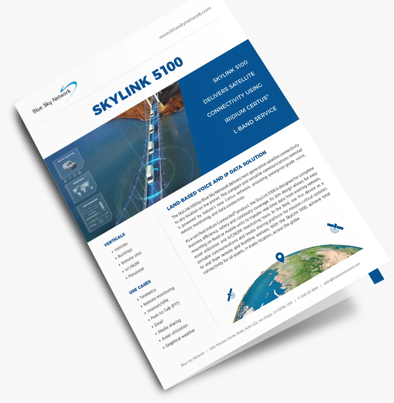
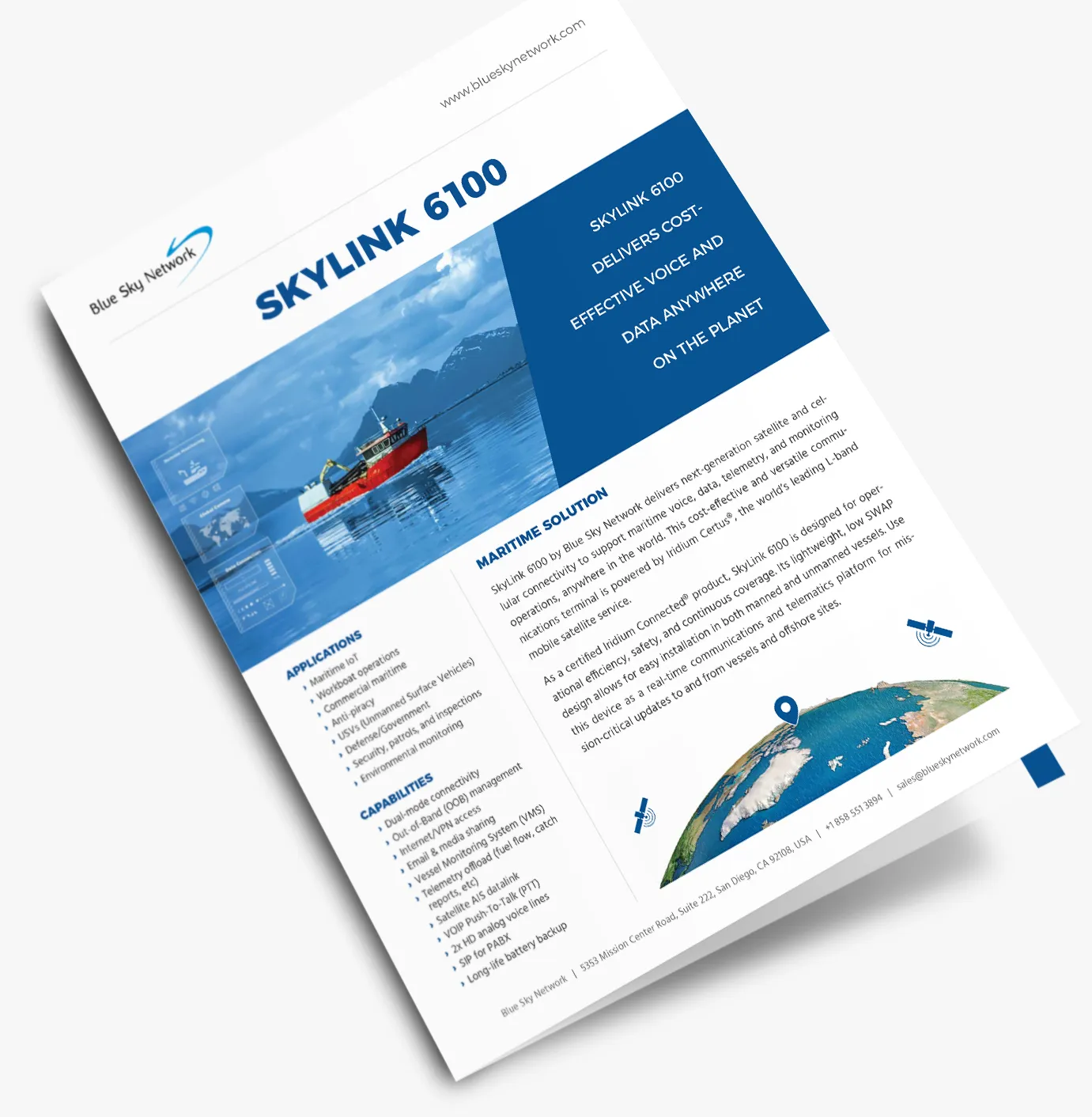
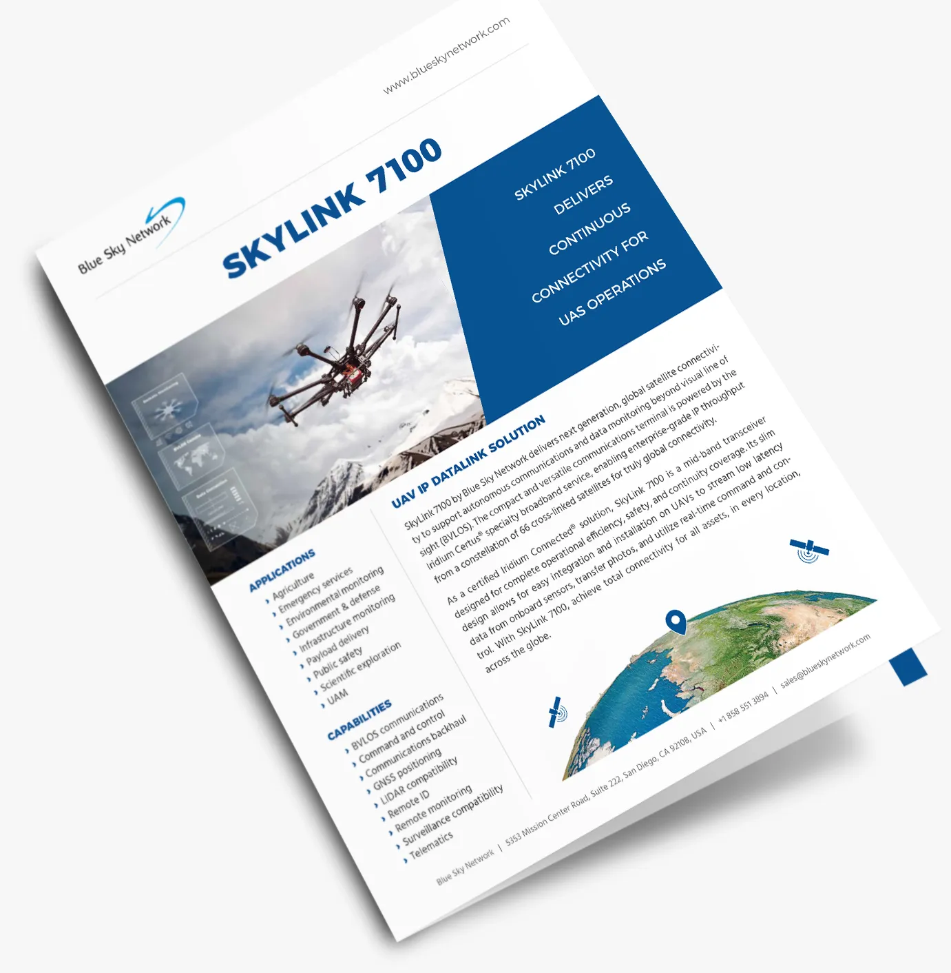
One architecture, three markets: the land, maritime, and aviation brochures.
Launch collateral in a hardware business is never finished. Specs change, certifications land, and every piece gets revised and translated. So I built the materials as templates that could absorb those changes, and the brochures went through revision after revision, in multiple editions and languages, without the identity losing its shape.
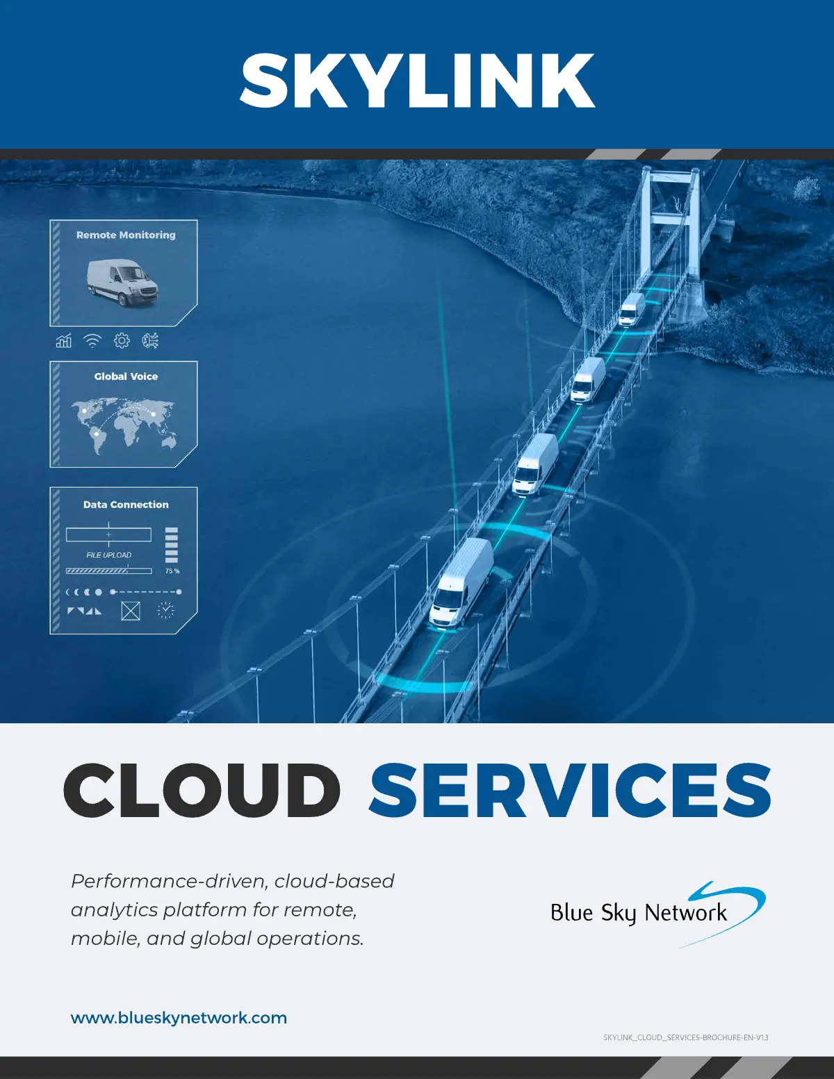
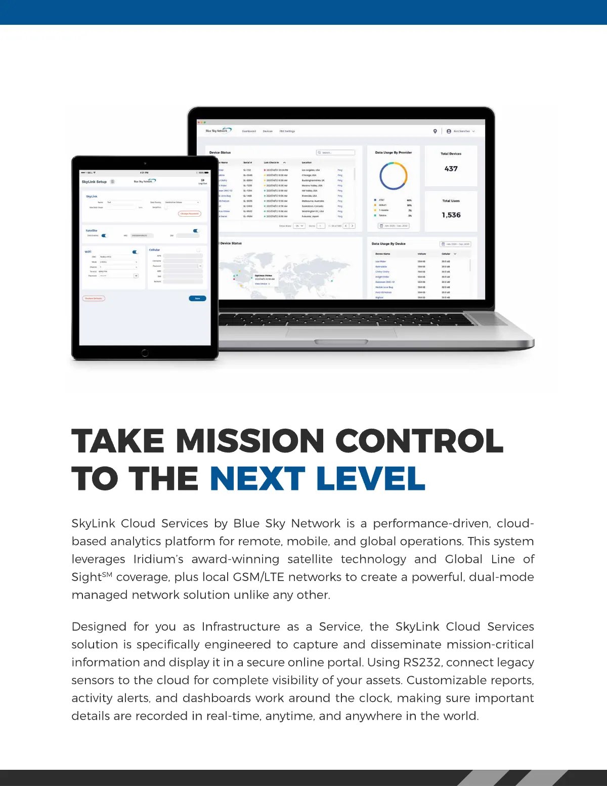
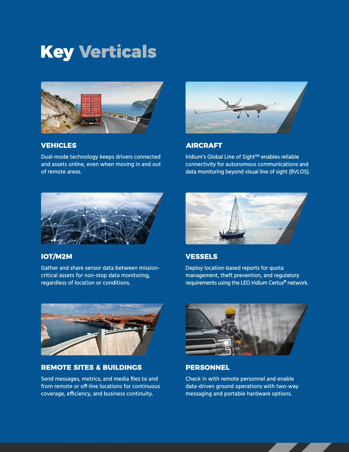
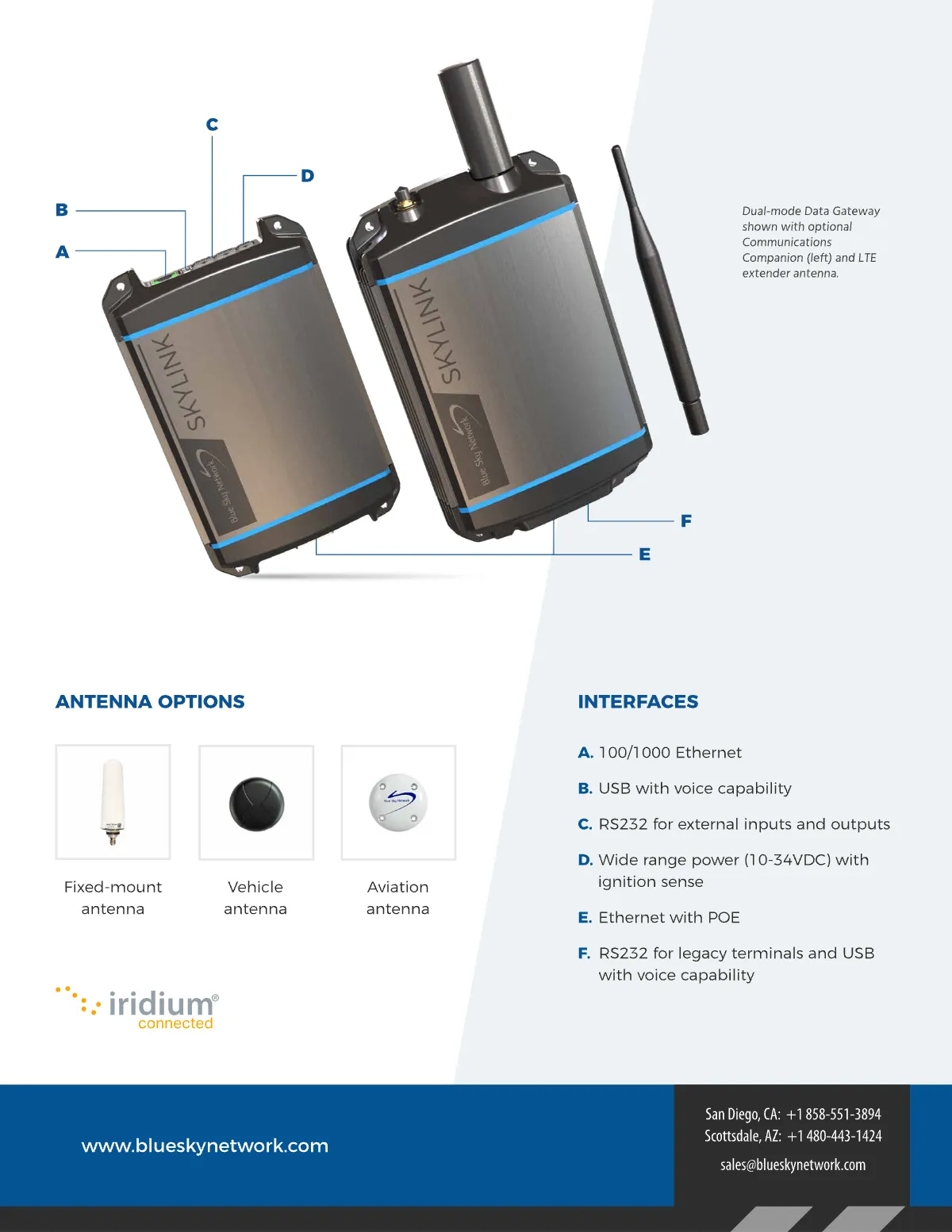
The Cloud Services brochure: the same system carrying the software side of the family.
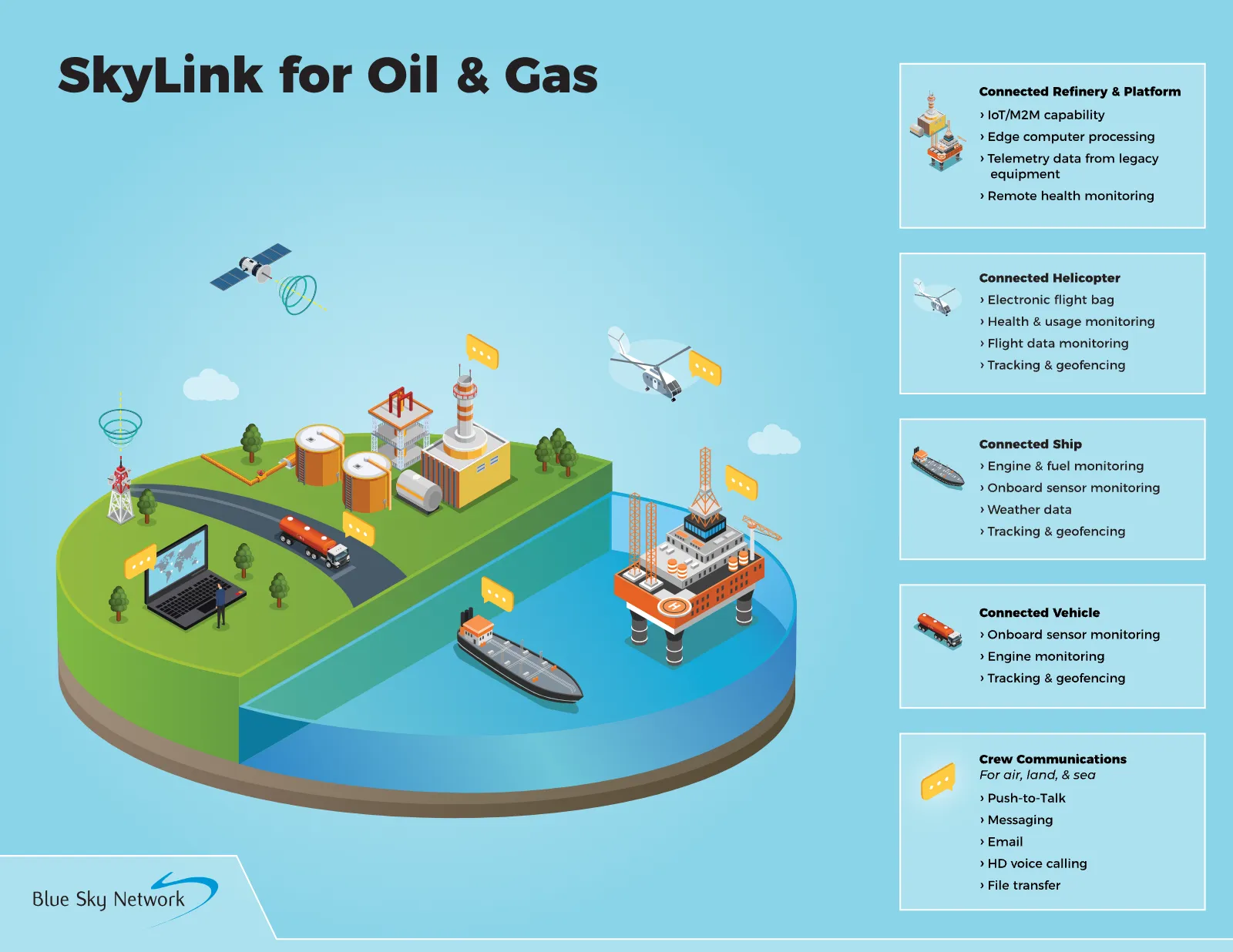
The hardest marketing problem SkyLink had: the product is a gray box (although a rather cool-looking one), and everything it does is invisible. Satellite links, dual-mode failover, sensor telemetry. None of it photographs.
My answer was to illustrate what the device connects: the assets and people operating in remote locations where cellular service is spotty or does not exist at all. I created a series of ecosystem illustrations, each one mapping SkyLink onto a specific industry’s operation. We highlighted the oil and gas version because that one industry uses every SkyLink vertical at once: helicopters and drones in the air, vehicles, lone workers, and refineries on land, ships at sea, all connected back to headquarters. It answers “what does this actually do” in a single image.
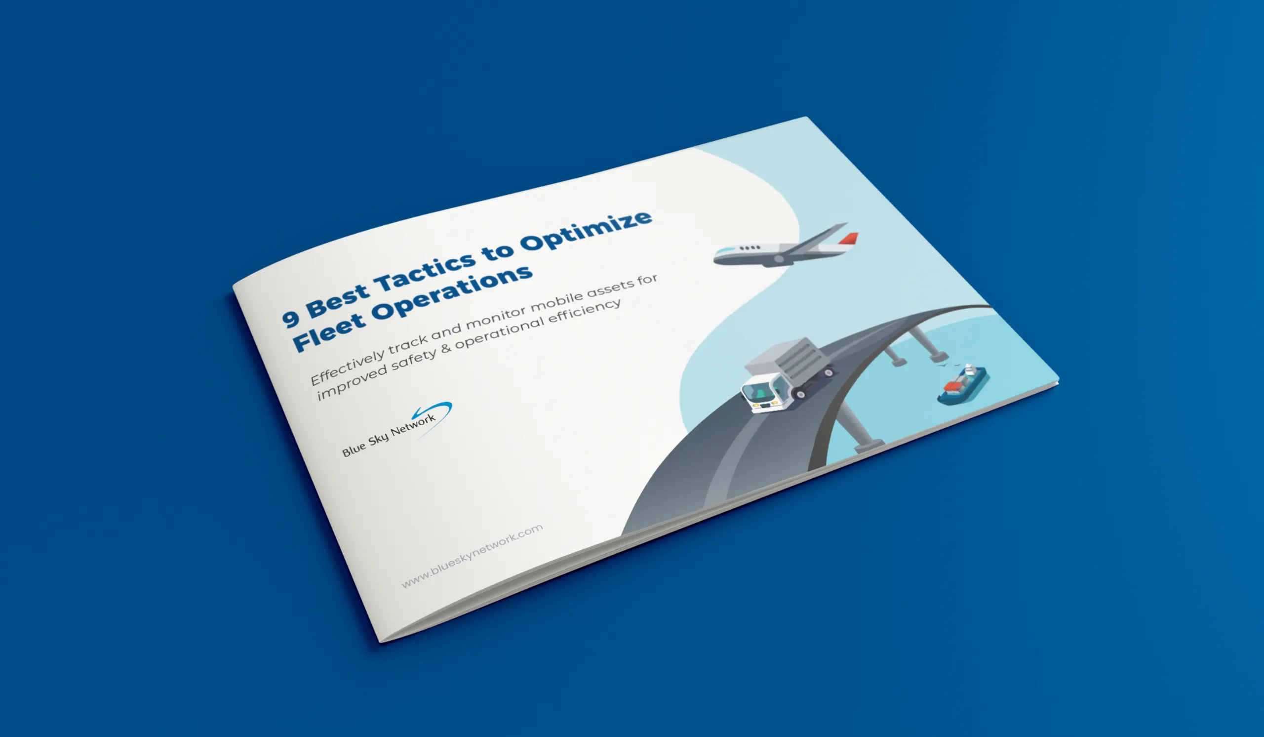
The same thinking drove the 9 Best Tactics to Optimize Fleet Operations ebook, a fully illustrated lead-generation piece I created for the launch. Rather than photographing hardware, it teaches fleet visibility and asset tracking through a consistent illustrated system, and introduces SkyLink only after establishing the problem. It gave the sales team a top-of-funnel asset the product photography never could.
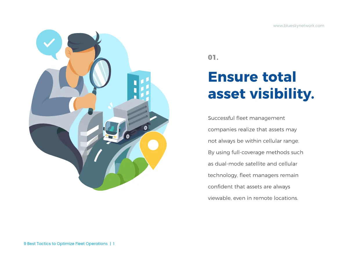
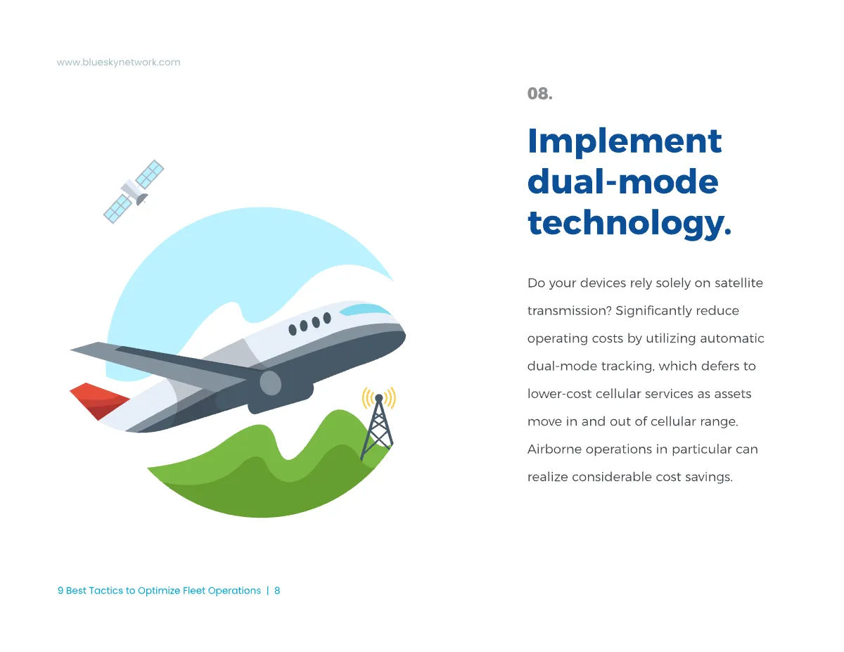
Inside the ebook: the illustration system carries the argument.
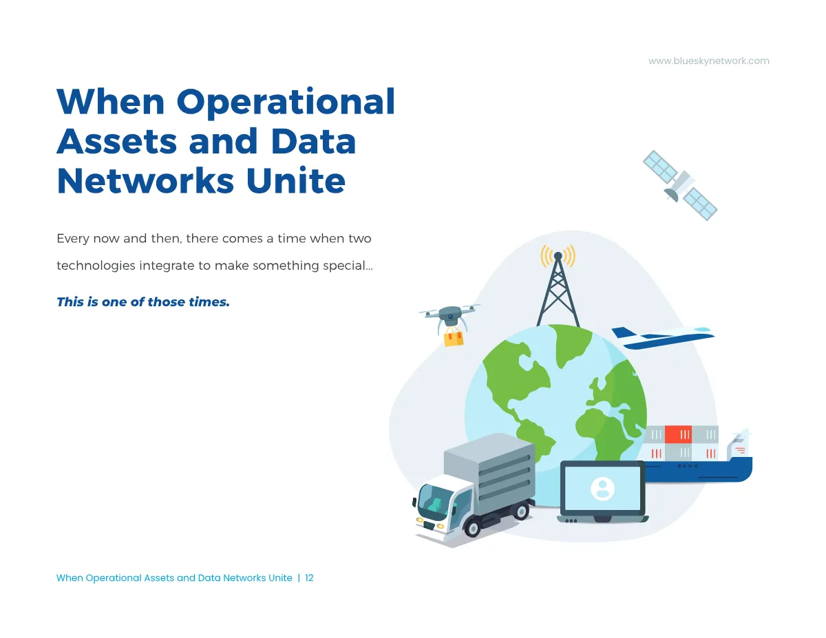
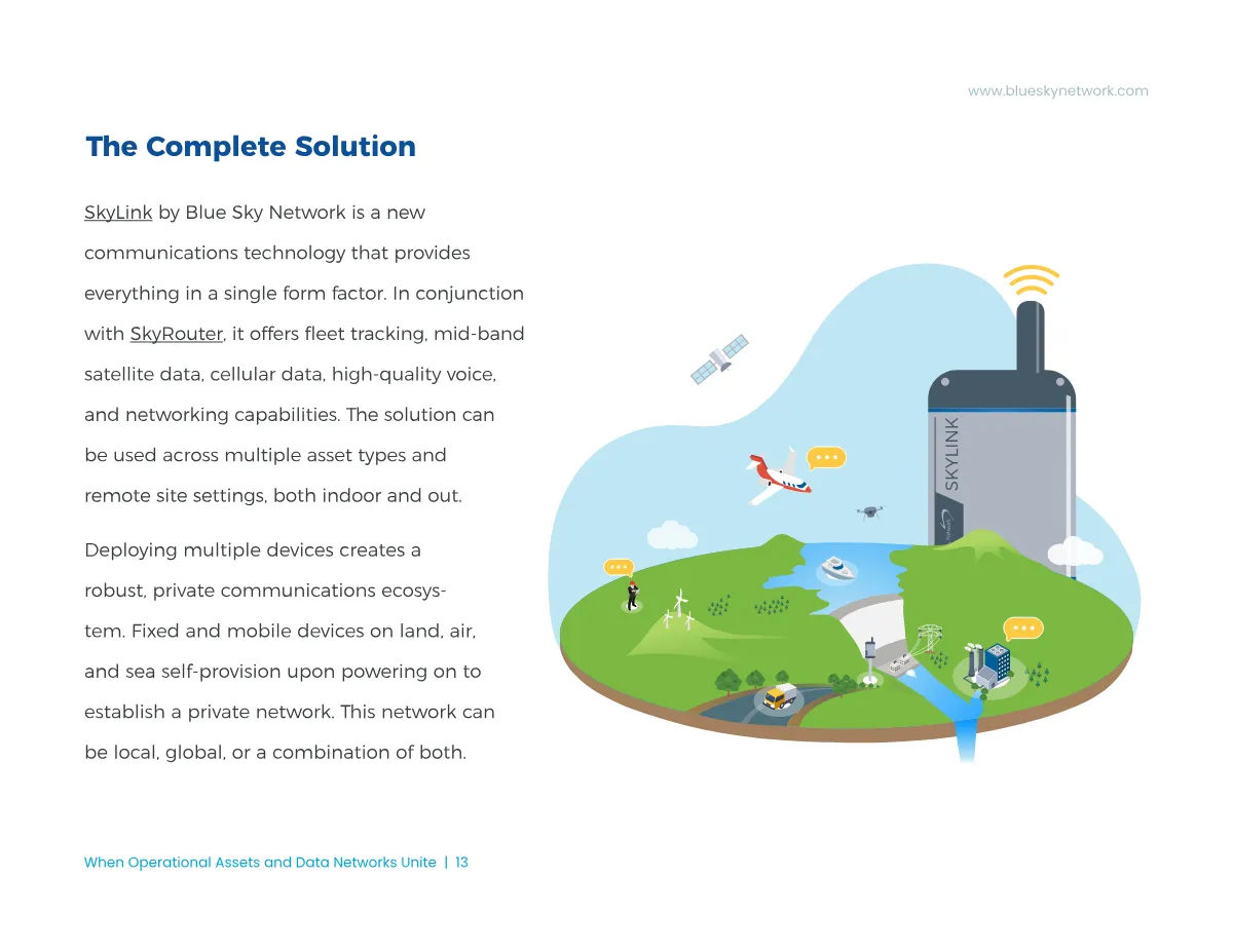
The reveal spread: the product appears only after the problem has been fully drawn.
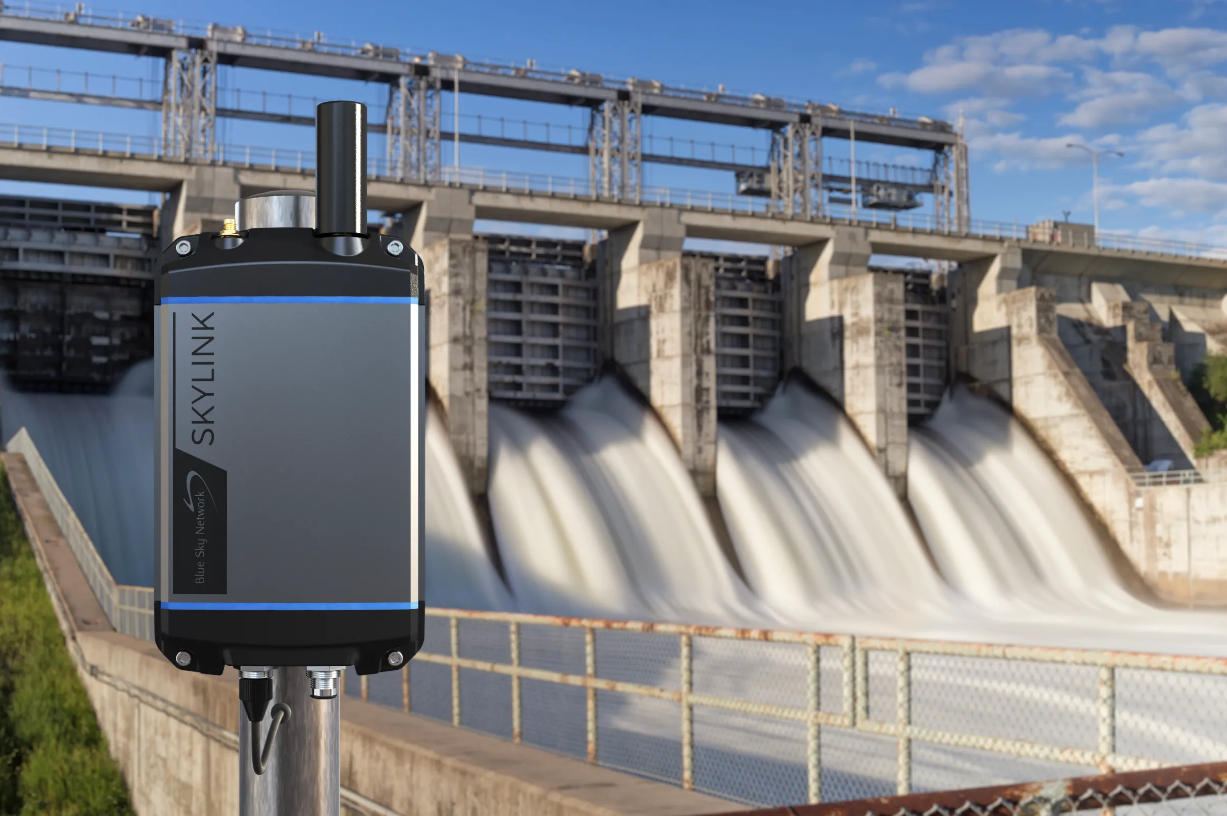
Where the product did need to be seen, I made it look like it belonged in the buyer’s world. I built device mockups and environment composites placing SkyLink hardware on real infrastructure, a dam-mounted unit against the spillway it monitors, so a B2B buyer sees deployment rather than a studio render.
The launch eventually got a physical footprint. I designed a modest trade show booth for SkyLink, and it became the identity’s proof of scale: the oil and gas ecosystem illustration blown up to wall size, the device rendered larger than life, and the brochures on the rack where visitors could take one with them.
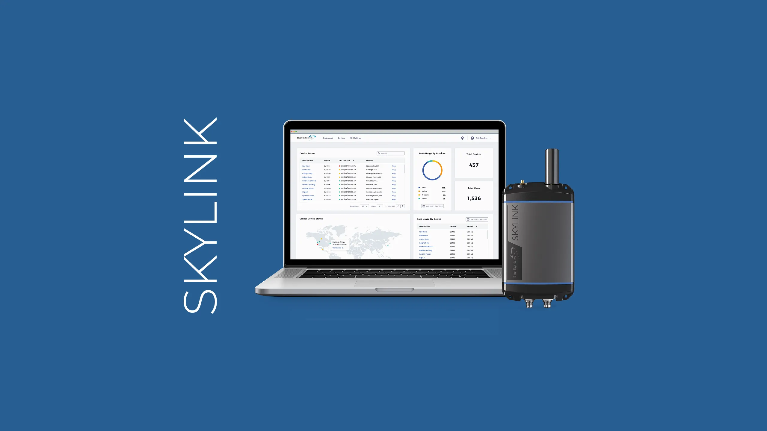
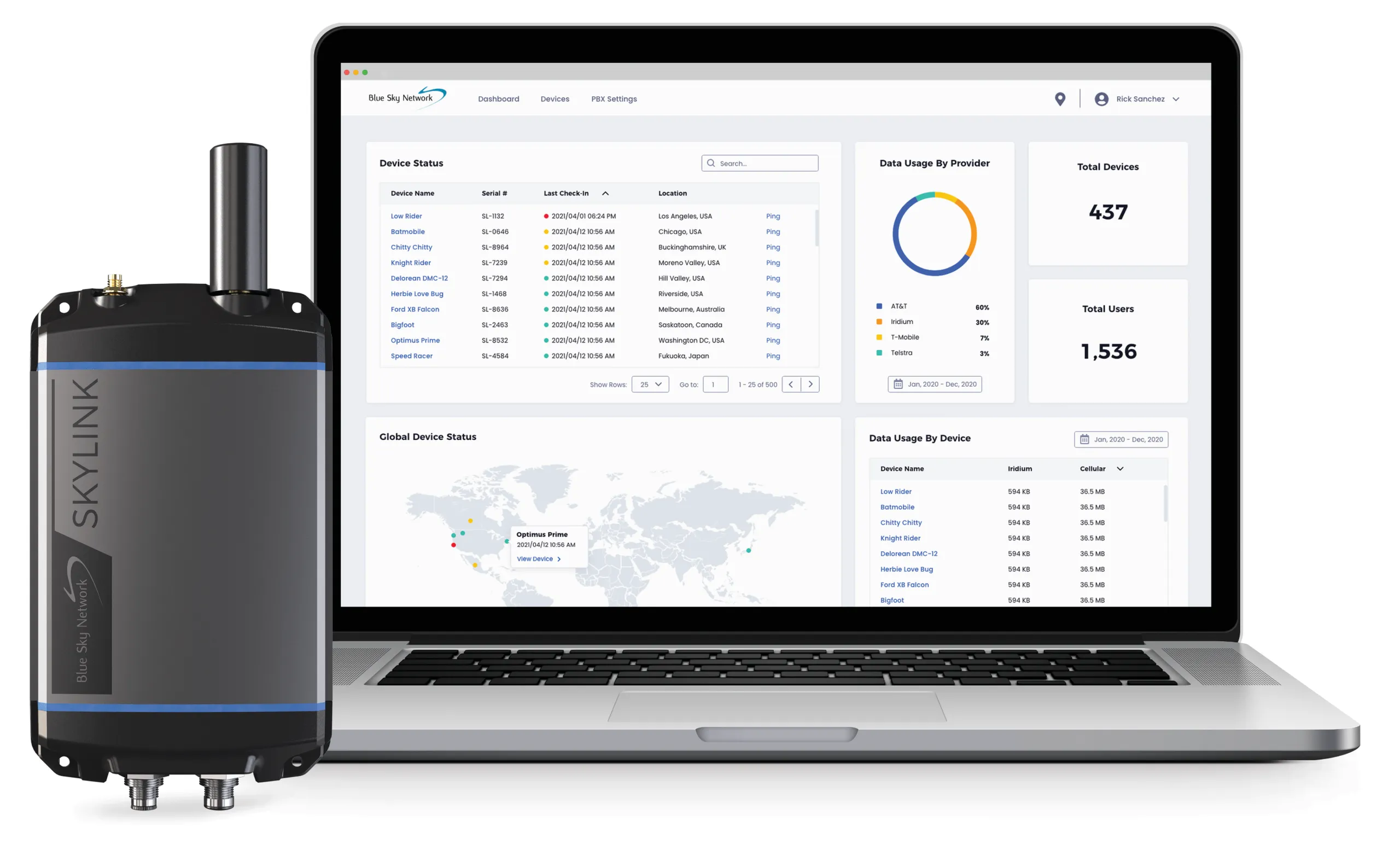
The software side got the same treatment. I designed the prototype UX/UI for the SkyLink web app, the dashboard where operators monitor device status, data usage by provider, and global asset positions. The interface appears throughout the launch materials as proof the platform is real, and every screen shown is my design.
SkyLink shipped in fall 2021, on schedule, with the complete brand system in market from day one. That September it won the Chairman's Award for Outstanding Innovation at the MSUA Satellite Mobile Innovation Awards.
The launch identity outlasted my tenure. After I left in late 2021, the platform went on to win an ATM/UTM Communications Award and to earn DO-160G aviation qualification, and Blue Sky Network still markets SkyLink as its award-winning flagship platform today, under the name and identity built at launch.