Surround Social
2025
An identity for an app that did not exist yet, scoped as version one on purpose so the brand could grow up alongside the product.
I was contacted about branding for an app being built by a small team: a map-based way to find things to do in your city. A few calls in I was helping shape core features, and by the time the identity work began I had joined as a co-founder.
There was no prototype, no brand history, and little documented beyond early meetings. The team needed something real enough to gauge reactions to, so the brand had to arrive before the product. My job was to fill in the blanks without locking future decisions in, so I scoped the identity as Surround 1.0 from the start: deliberately light, strong enough to represent the app while in development, flexible enough to grow with it into the future.
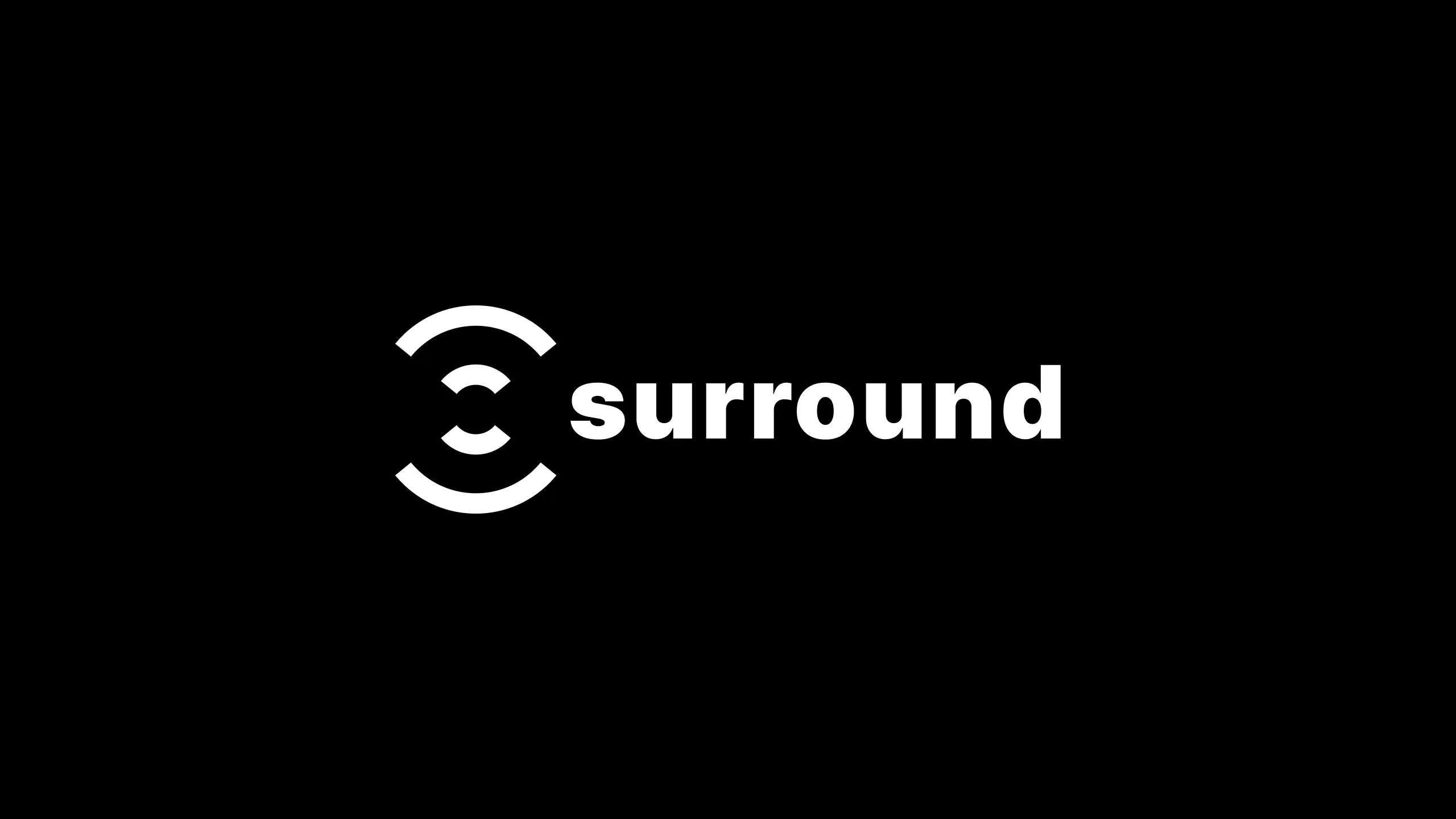
The logo started from a list of plain nouns for what the app was. It had to hold people, place, and connection in one shape, and ideally echo the word surround itself. We worked through a handful of directions as a team.
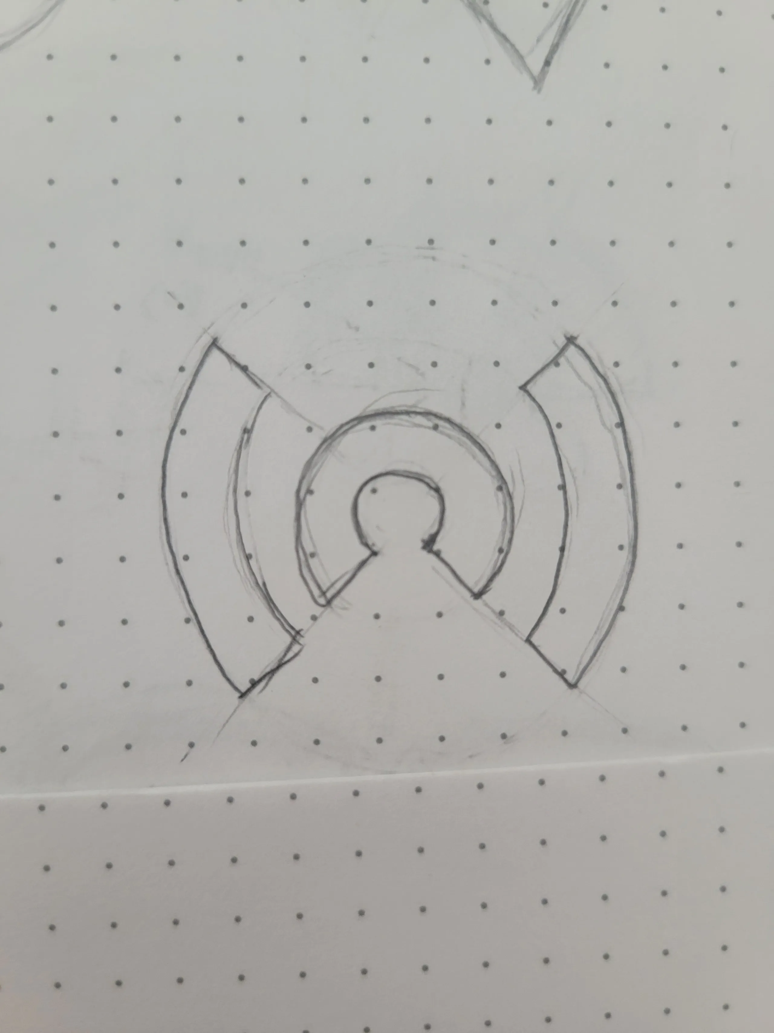
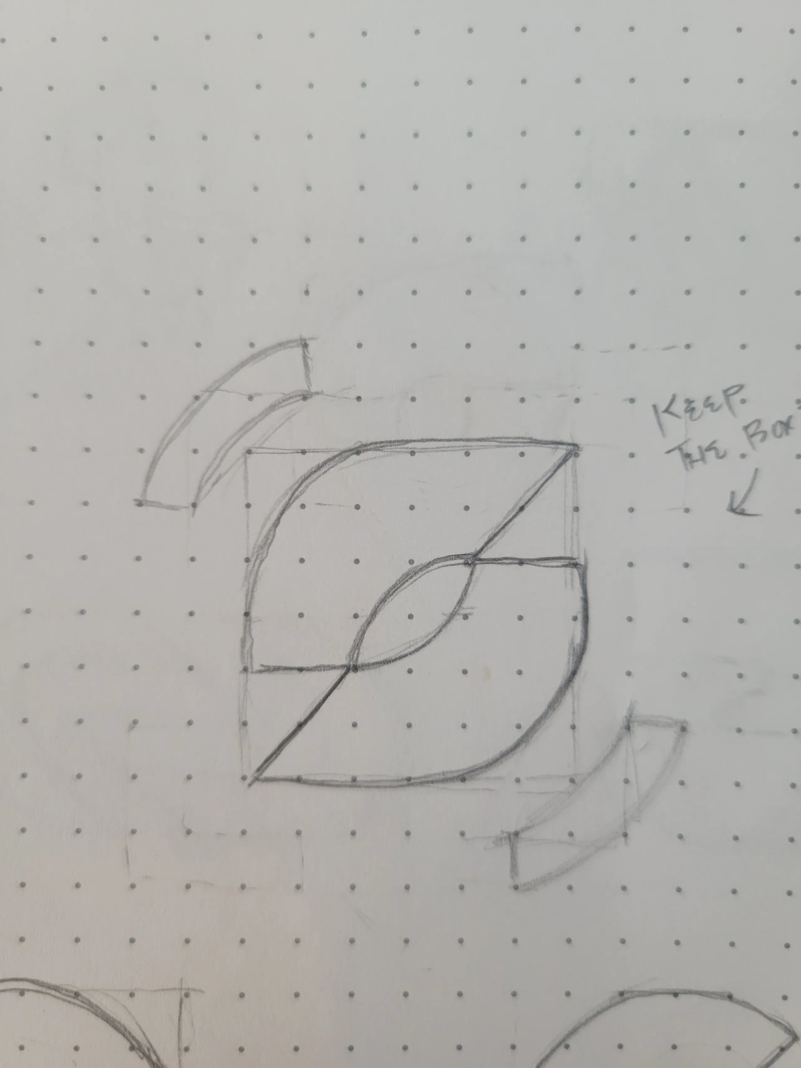
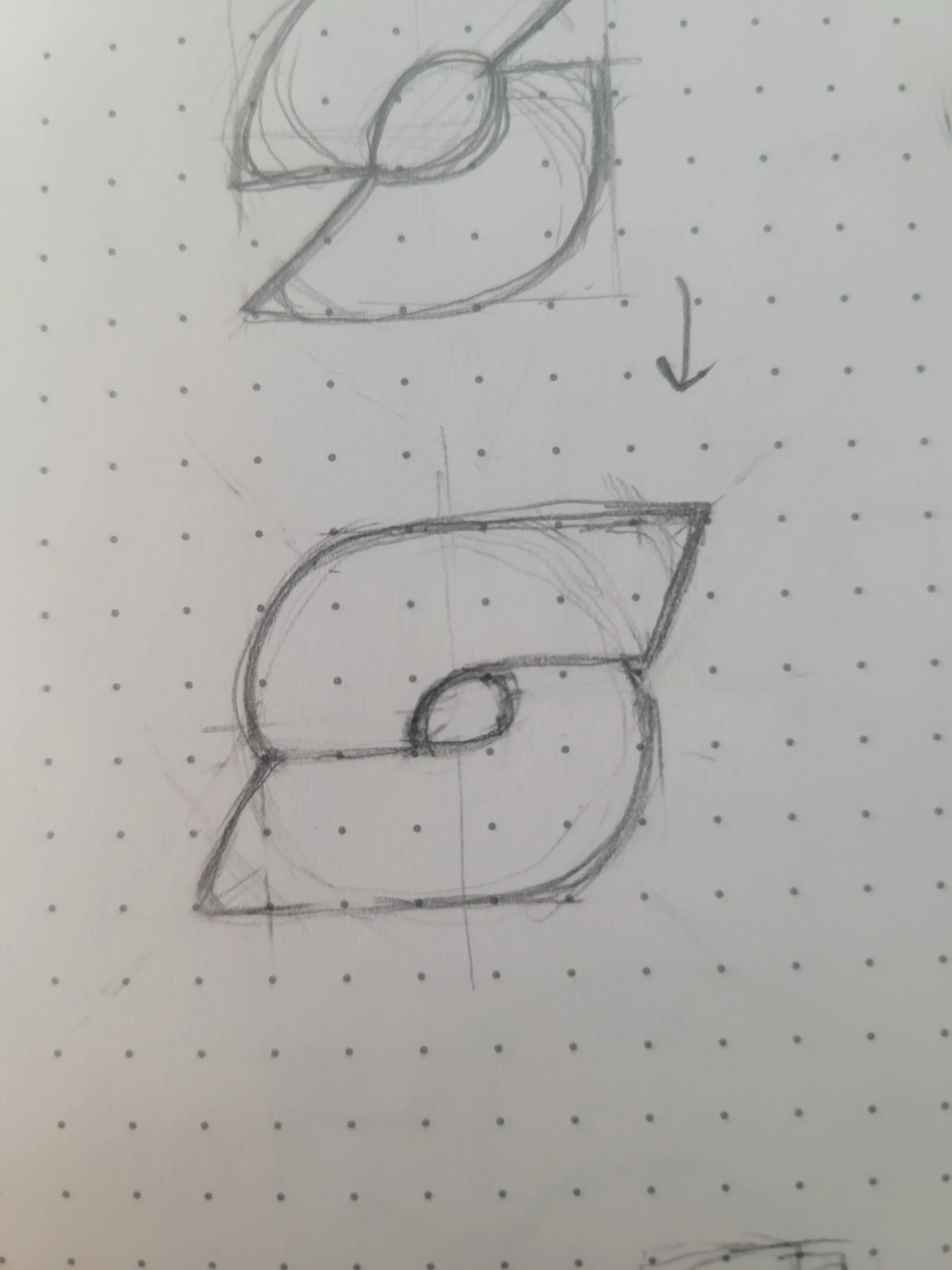



Three early directions, pencil to vector. The first is the concept we carried forward.
I gathered imagery of events and nights out that shared harmonious color, and pulled an early palette from that. We weighed it against a brighter neon direction built to stand out on a home screen, went back and forth, and settled on the original. The event-derived palette held together on its own terms; color theory won this round.
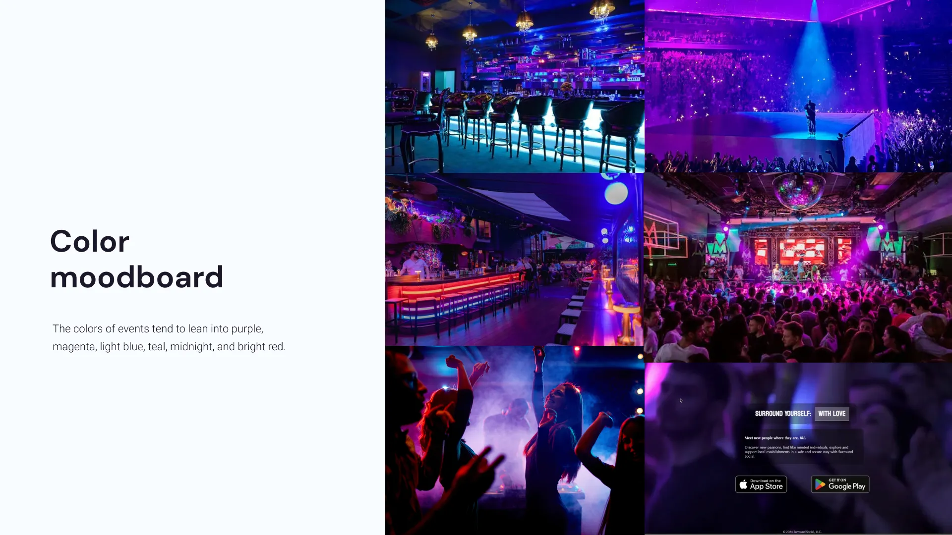
Color exploration. Third-party event photography shown as reference imagery; the annotation and palette direction are the work.
We chose the direction built from arcs wrapping a center point, the way a signal radiates or a crowd gathers around something worth seeing, and I refined it from there.


Brand photography needed to feel fun, land with young professionals in the 25 to 35 range, and show the mix of things we believed the app would surface: live music, happy hours, festivals, plans outdoors. At that stage those were informed guesses; development had not started. The direction was chosen so it could stretch as the real feature set emerged.
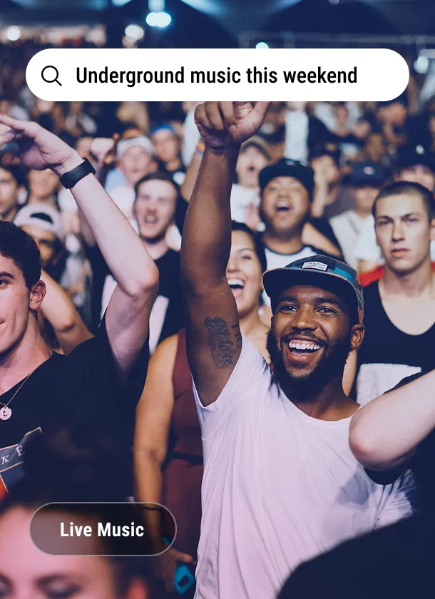
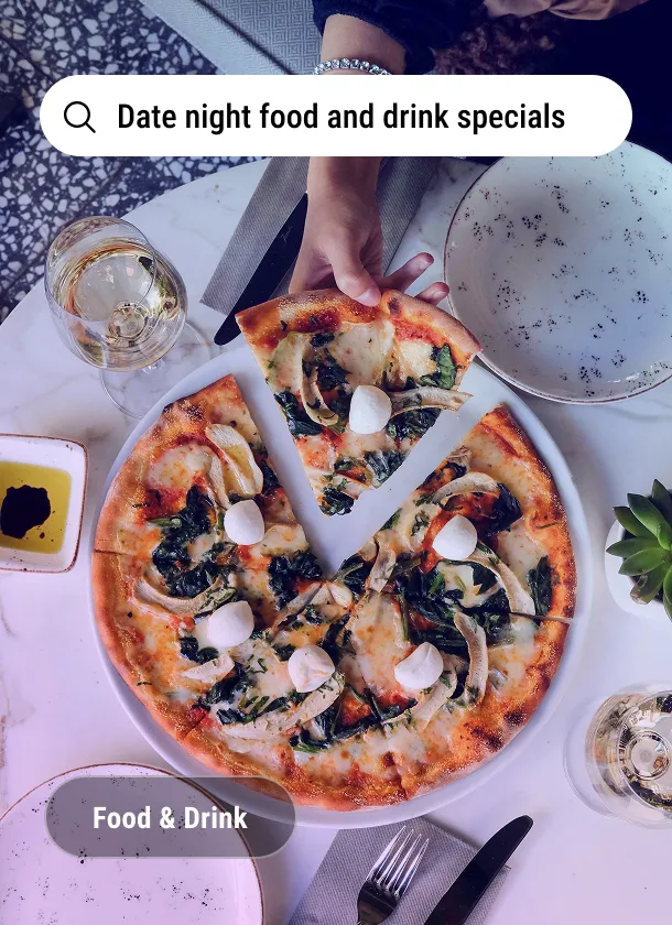
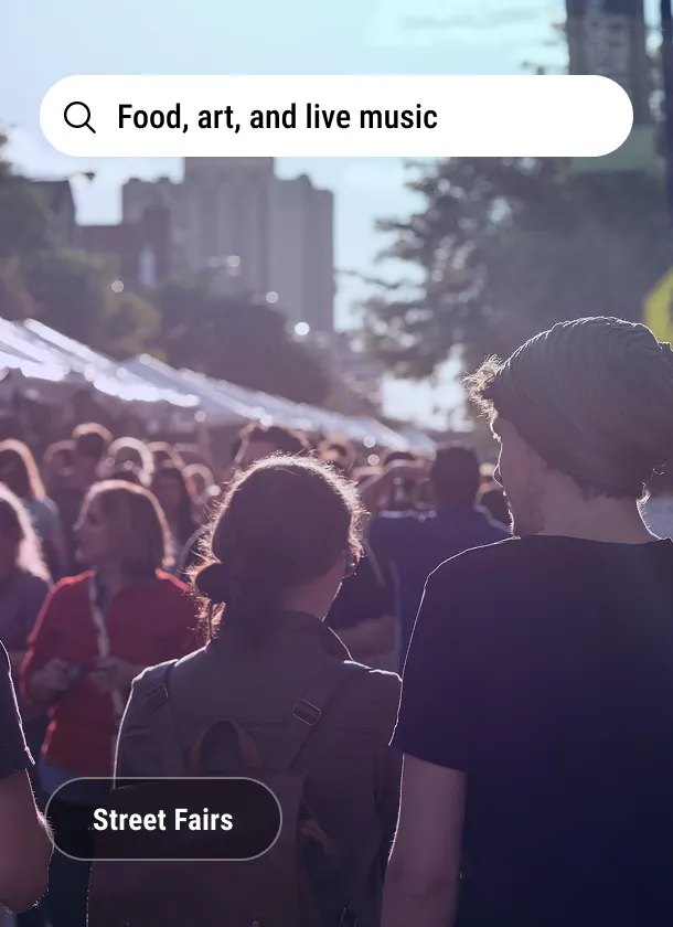
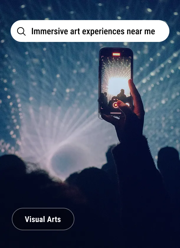
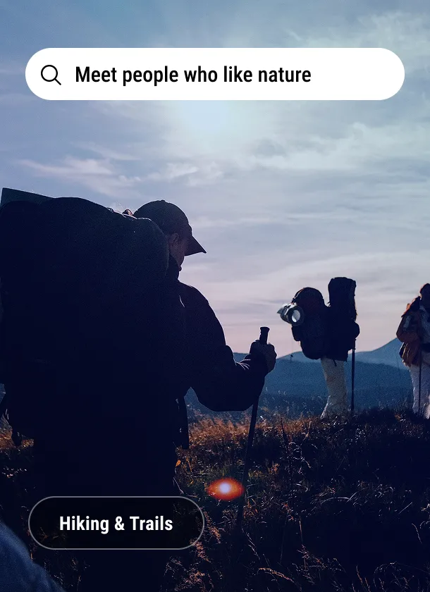
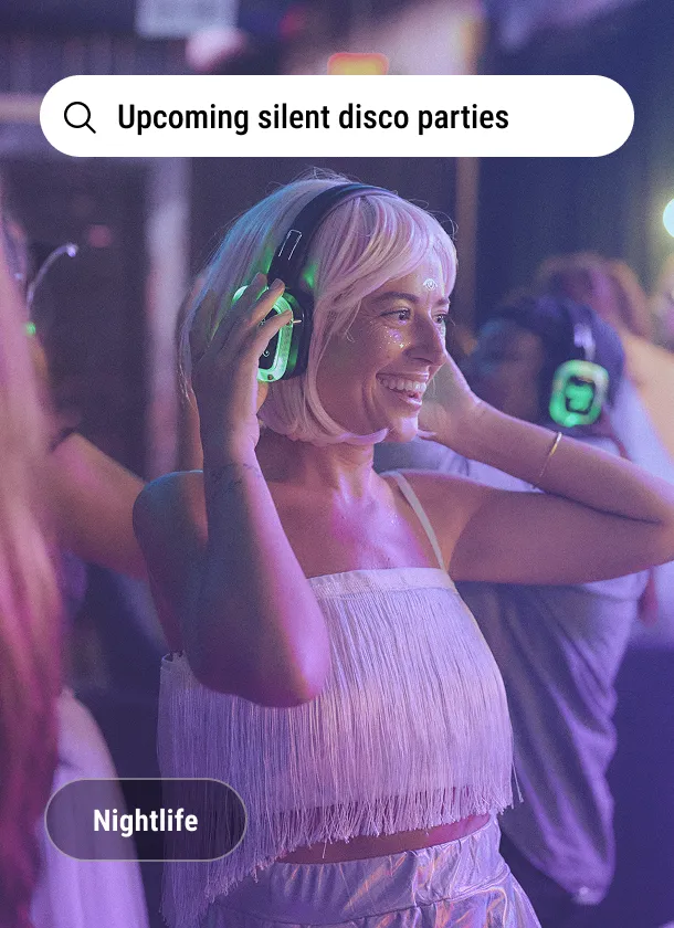
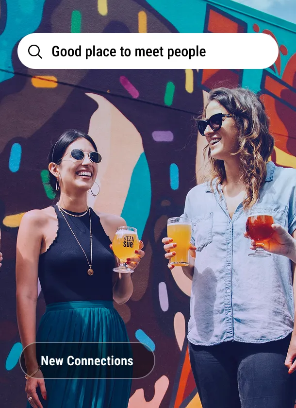
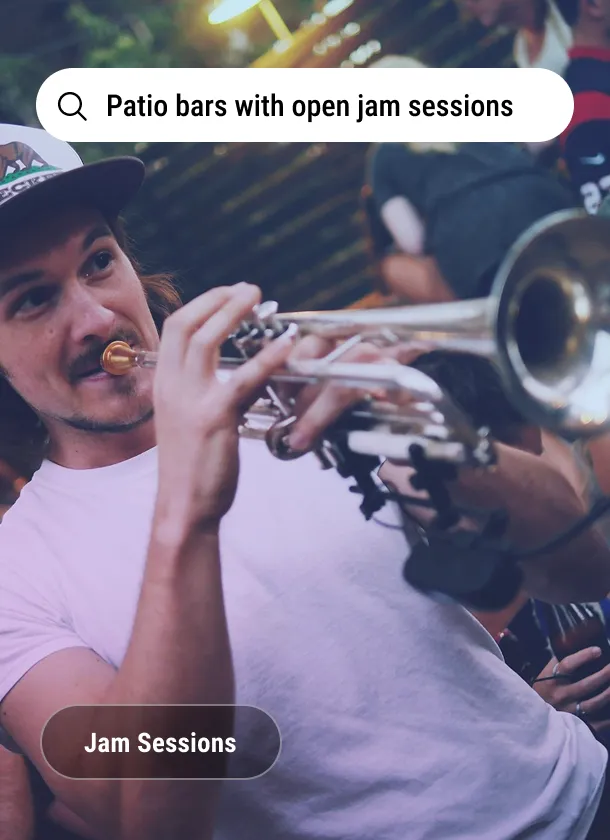
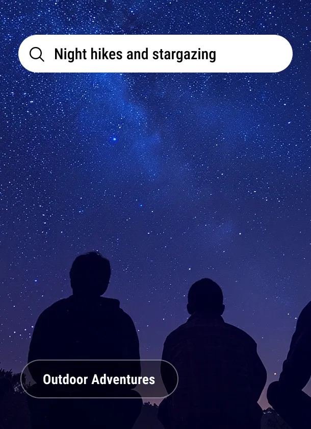
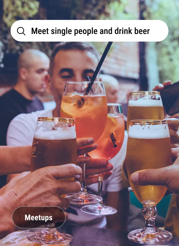
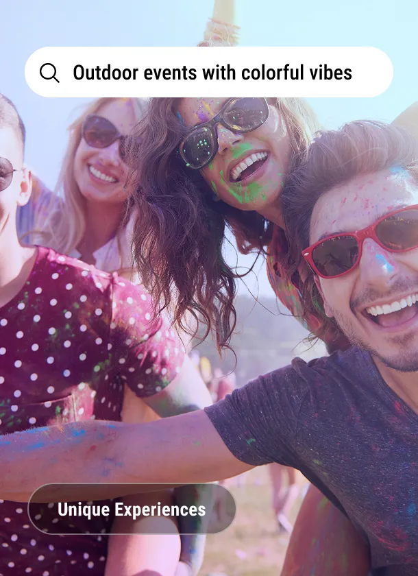
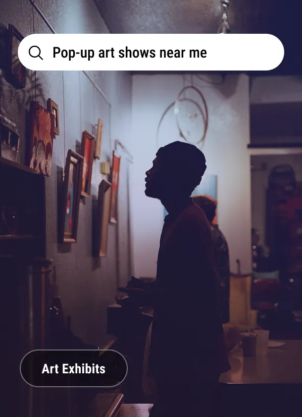
Imagery direction applied: photography selects under the search language that carries them on the landing page.
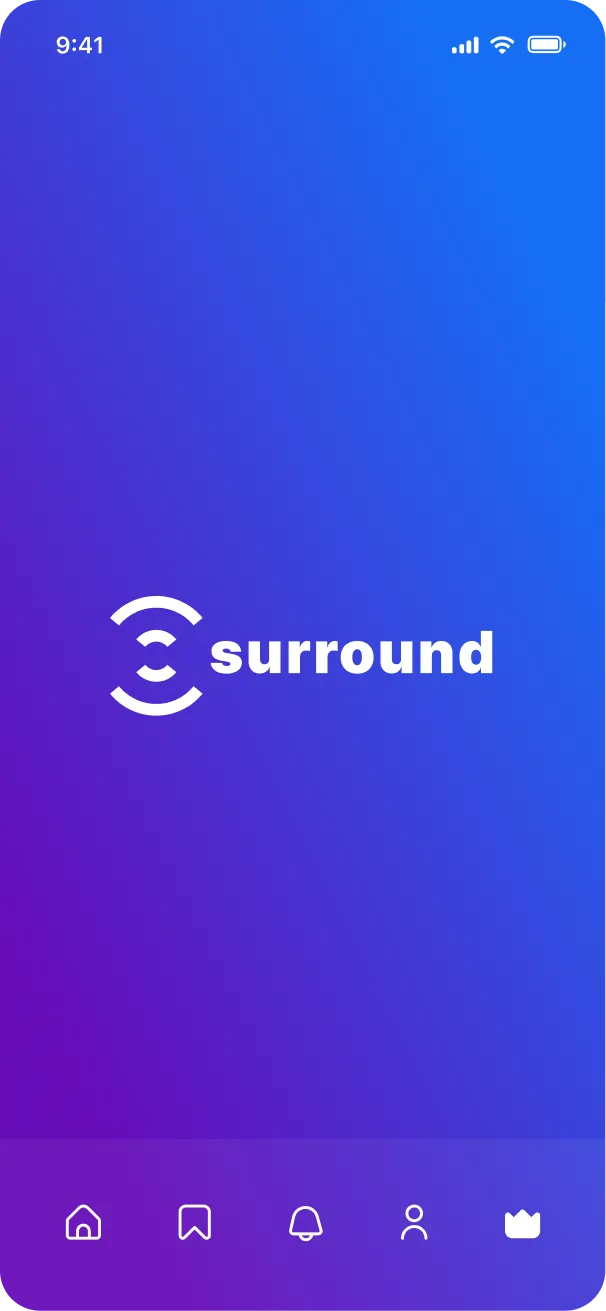


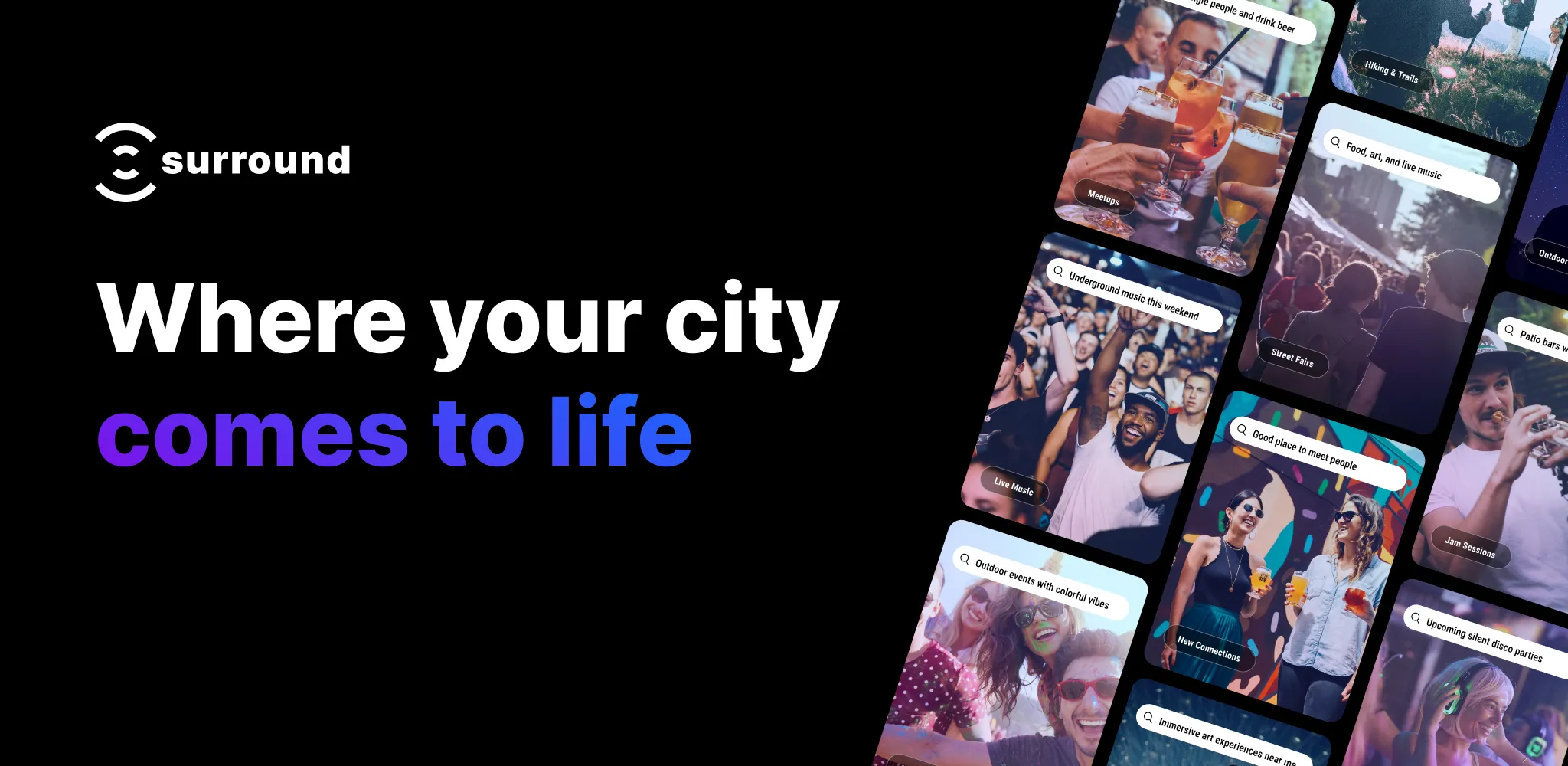
With the identity settled, I designed and built an early-access landing page: the content, the layout, and the UI, built on WordPress. Its job was simple: say what Surround is, show what it will feel like, and collect signups from people who want it.

The brand and demo were well received, and the app is in development.
Testing with real users gave us a clear signal on what to build next. The app is changing shape as it grows, and when it lands, the brand will evolve with it. That is what version one was for.