FLYR Website 2.0
Creative Lead, 2021 to 2024
FLYR’s website was built when the company was one product for one industry: revenue software for airlines. By the time I took over the web presence, the company had outgrown the site. There were now three application suites, more industries on the roadmap, and a platform story with nowhere to live. My job was to extend the site’s architecture to carry all of it, without replacing the brand underneath. The redesign was finished and never launched; FLYR changed direction with a 2023 rebrand first. The work is here because the thinking holds anyway.
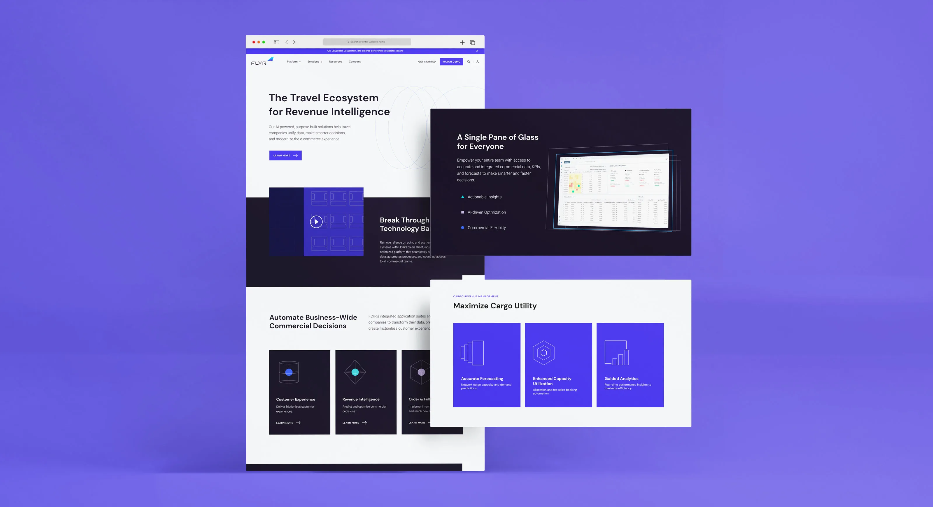
The 2021 site did its job well for the company that built it. One product, one industry, one headline: The Revenue Operating System for Airlines. Every page hung off that sentence, and the navigation was flat because there wasn’t much to navigate.
Then the company changed shape. One product became three application suites. Airlines became airlines, cargo, car rental, and hospitality. The site had no architecture for any of it. There was no room to explain a platform, no place to put a second suite, and a headline that named a market the company had already outgrown. The problem wasn’t the design. The problem was the floor plan.

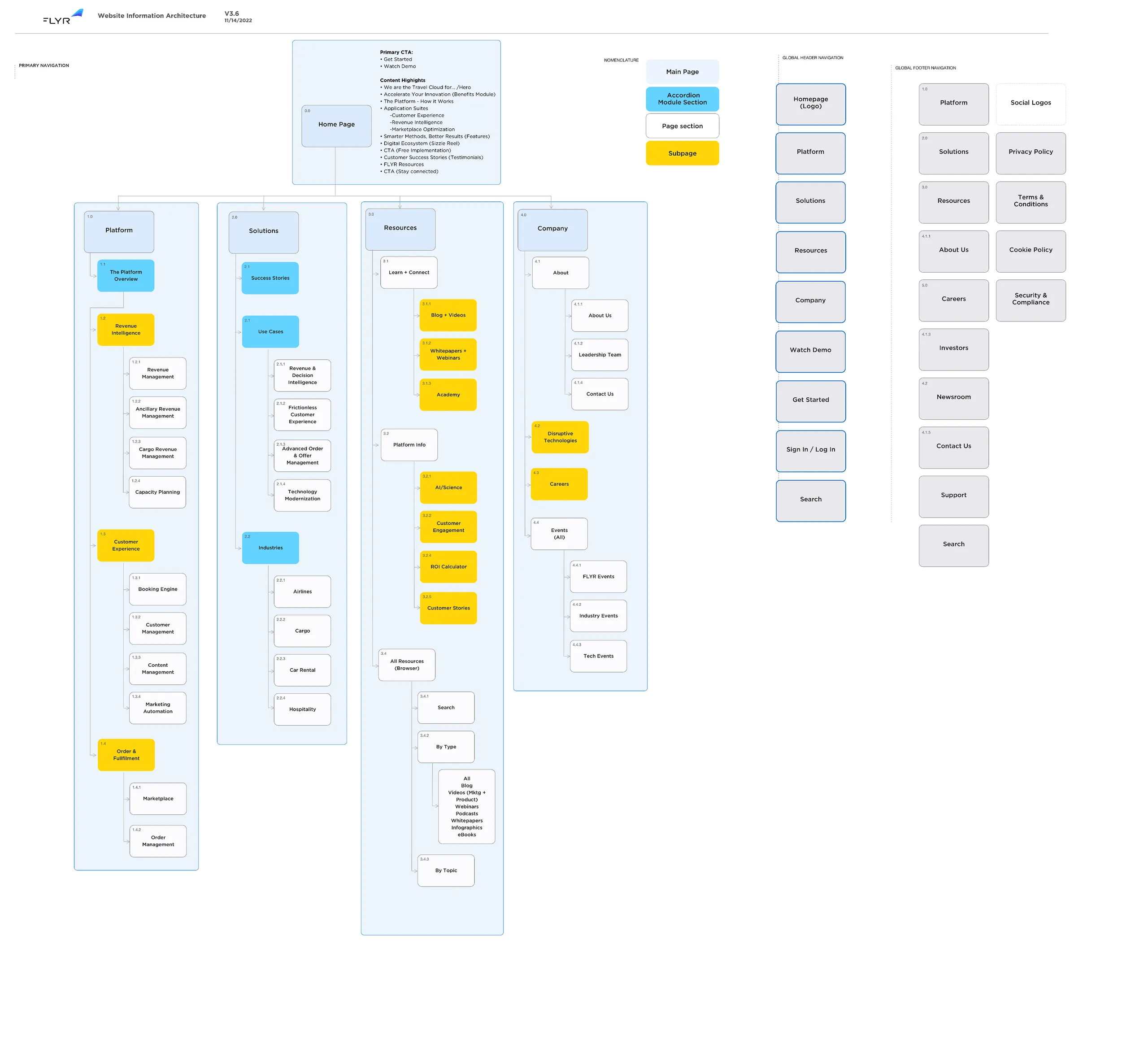
Where everything lived was half the project. Three suites, four industries, a resource library, and a platform story all needed front doors, and the doors had to make sense to a visitor who had never heard of any of it. We went back and forth on the structure internally more than on anything else, and the map that ended the argument was version 3.6: four sections at the top, Platform, Solutions, Resources, Company, with the suites living under Platform where they could gain siblings without a remodel.
That last part was the point. FLYR was a startup in full motion: the roadmap, the market, and the product offering itself were all still being decided while we built, and revisions came as fast as the company changed. We were building the airplane as it rolled down the runway. So the architecture wasn’t designed for the company FLYR was on any given week. It was designed for the company FLYR was becoming.
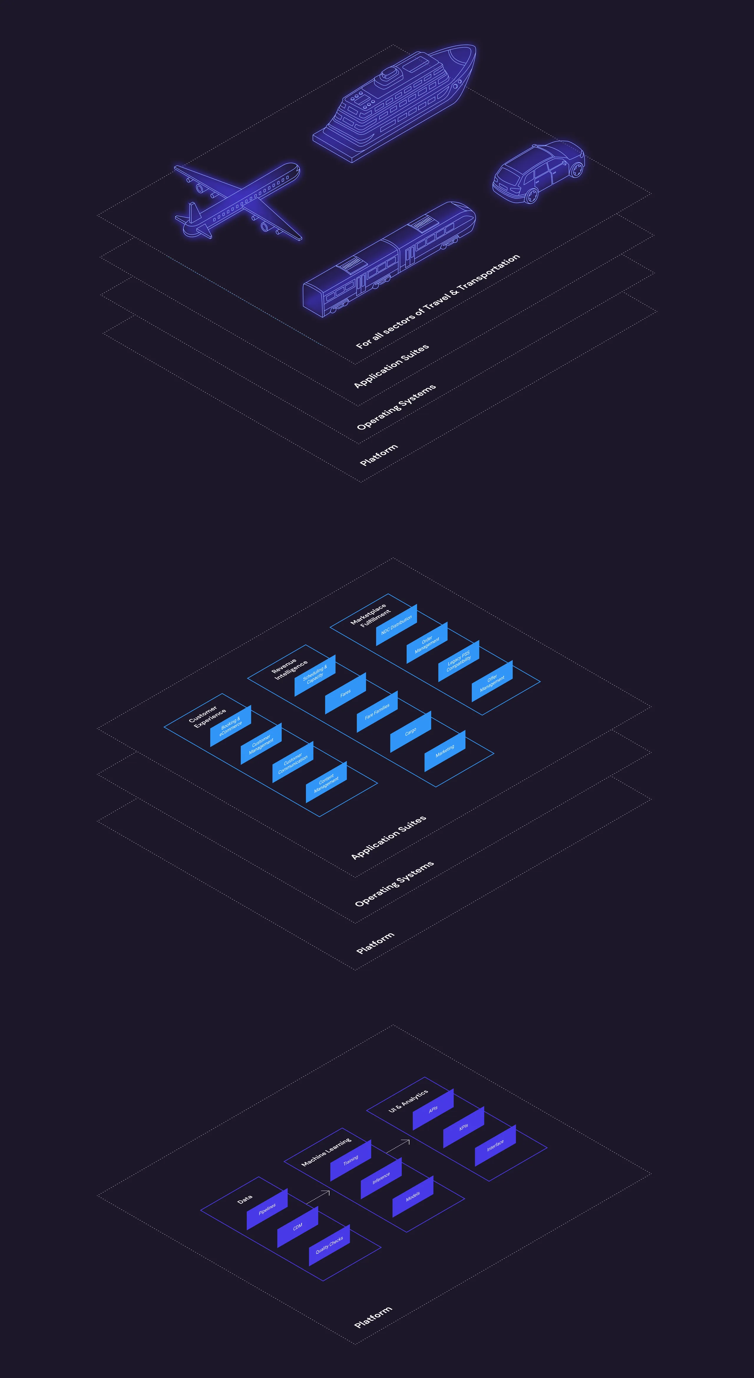
The brief was extension, not rebrand. The wordmark stayed. The purple stayed. What the brand didn’t have was a way to draw the thing the company now sold: a platform with layers, suites sitting on top of it, industries sitting on top of those.
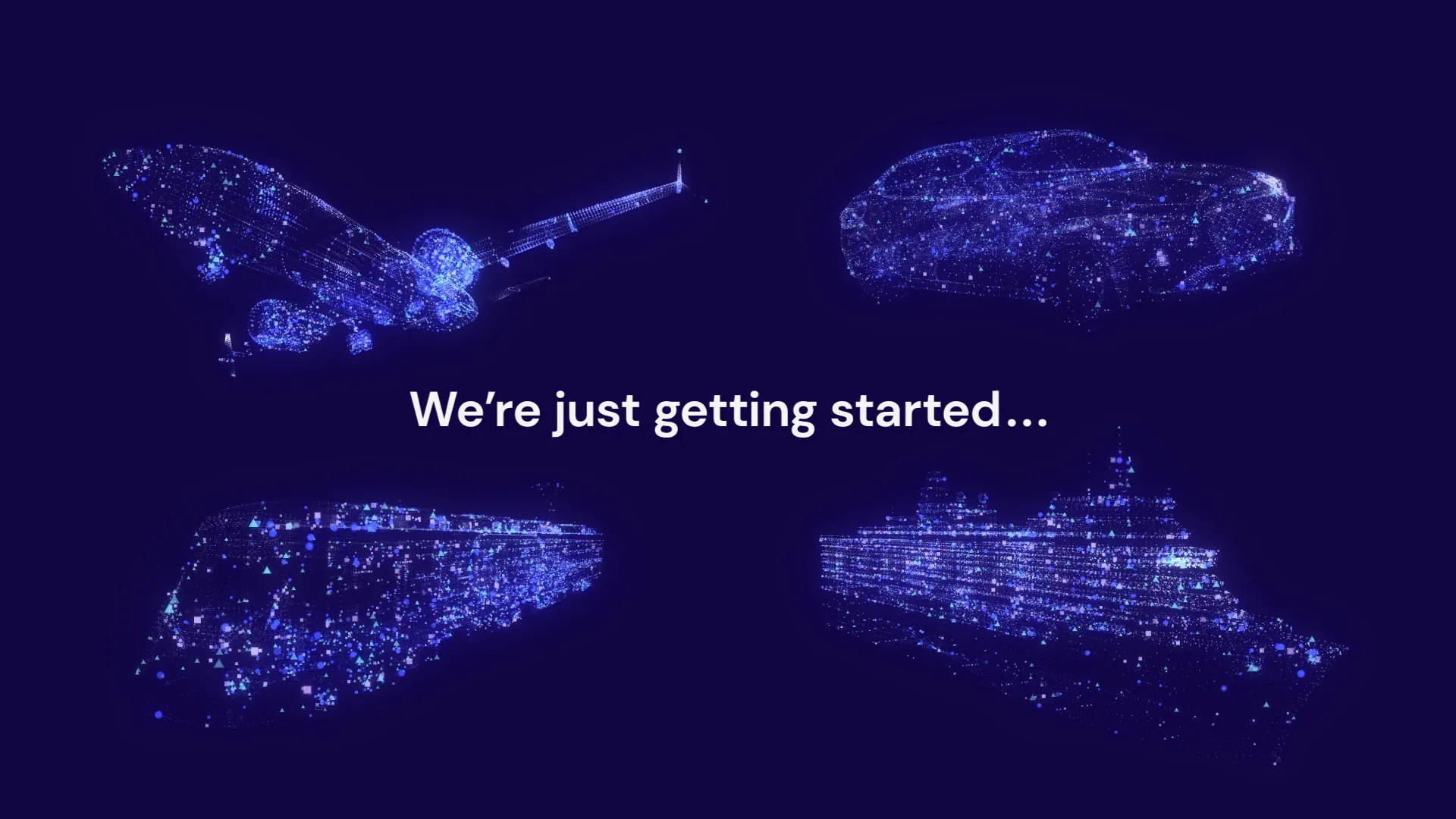
So the expansion got its own vocabulary. A layered isometric illustration system that renders the platform as literal architecture, product UI shown as product UI instead of stock photography, and motion that puts the suites in orbit around the data they share. New language, same voice.
A platform site needs more icons than a product site, and it needs them to behave like a family. The set was drawn custom in three styles, one per job: dimensional marks for the suites, flat marks for the features, and a small UI set for the interface itself. Three different drawings, one logic underneath.



The suite icons are containers. A suite holds products inside it, so each mark is a wireframe volume with something suspended in the middle.





The feature icons stay flat. A feature holds nothing inside it, so the marks carry no depth.
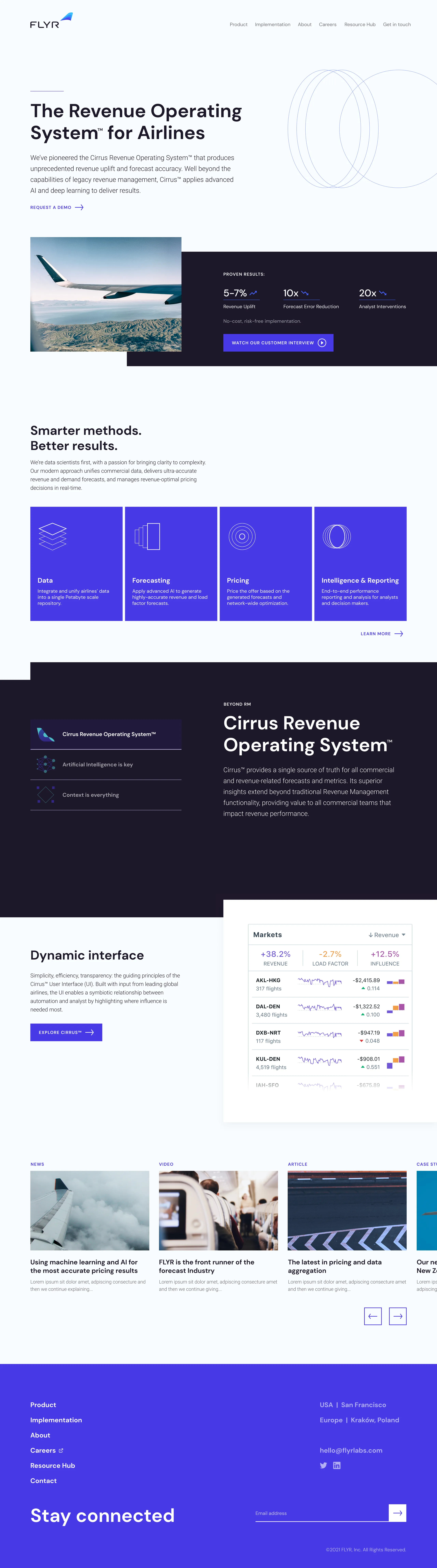
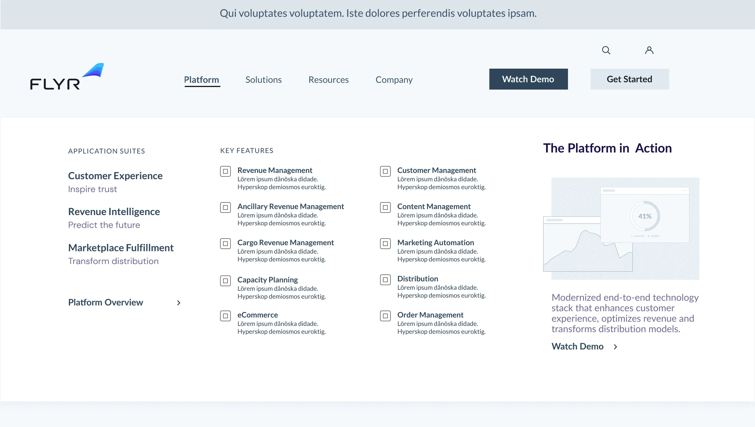
The proof of an architecture is the pages it makes possible. The surfaces below couldn’t have existed on the 2021 site. There was nowhere to put them.
Each one is the structure doing its job: a suite explained on its own terms, features grouped where the architecture says they belong, and the platform told as a story instead of a footnote.
One detail left deliberately visible: the copy on these pages was never settled. Headlines are working drafts, and placeholder text stands where product descriptions kept changing, because the offering they described moved faster than any sentence written about it. The structure was built to hold still while the sentences changed.
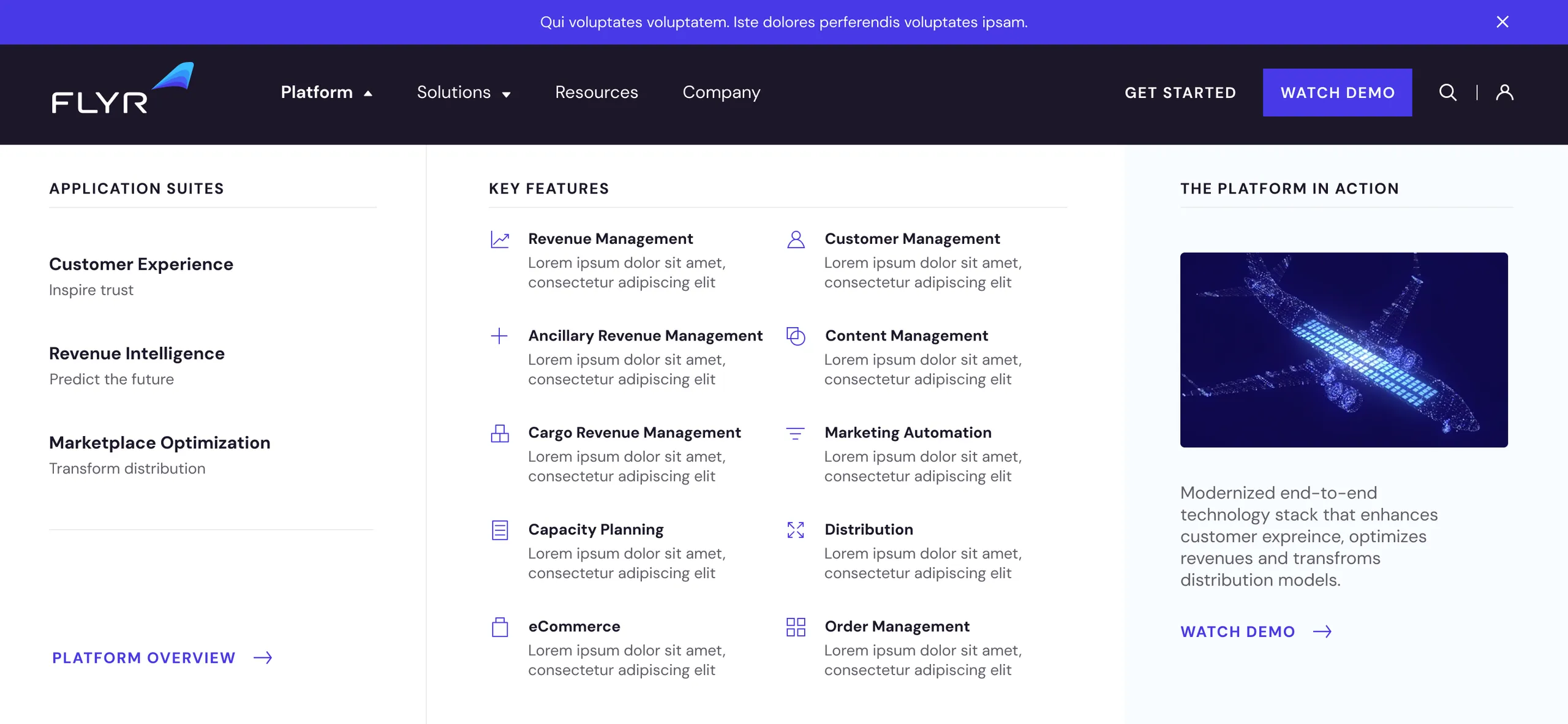


The finished surfaces, end to end: the mega menu, a suite page told top to bottom, and the platform story. Every one of them is a room the old floor plan didn't have.
Extending a brand is a different discipline from replacing one. The wordmark, the palette, and the voice all had to stay, and everything new had to look like it had always been there. It did.
The site itself was retired before launch when FLYR changed strategic direction in 2023 and rebranded. The architecture was built so the company could keep growing into it. The company grew in a different direction.